It Starts
This a summary of my 30 Day Map Challenge 2025. In a reckless moment on the 1st November 2025 I thought I would have a go a making a few maps and see how far I’d get to before stoping. Some four-and-a-bit weeks later, this is what I got and the associated social-media Fosstodon toots.
Week 1
2025-11-01 Intro to the Intro
I can’t remember what motivated to do this. Or even what started this, other than I must have seem someone toot or post about the #30DayMapChallenge2025, and thoughts I could start and then give up when I felt like it.
In a vain attempt for #30MapsInAMonth here is a “Eurocentric” world map EPSG:3034 equal area projection using on WorldPop 1km² data showing projected population change between 2020 and 2030.
#30DayMapChallenge
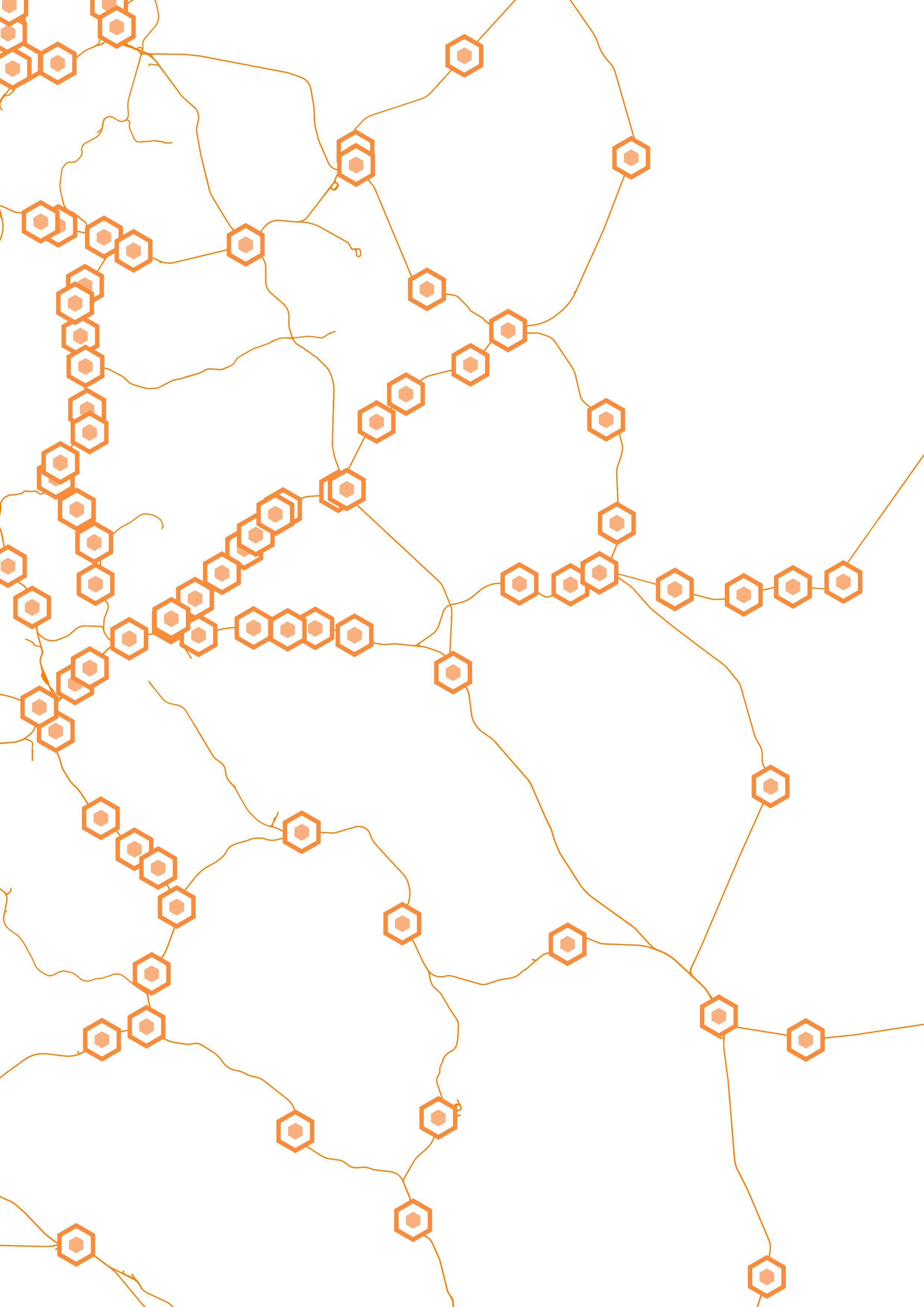
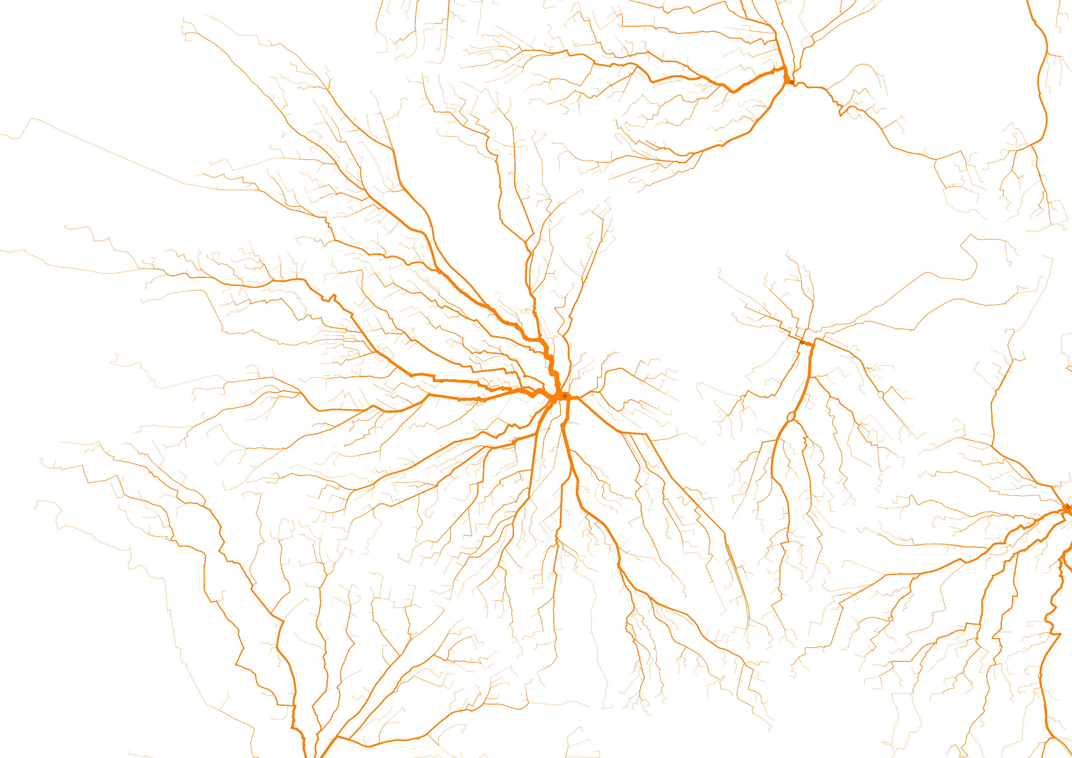
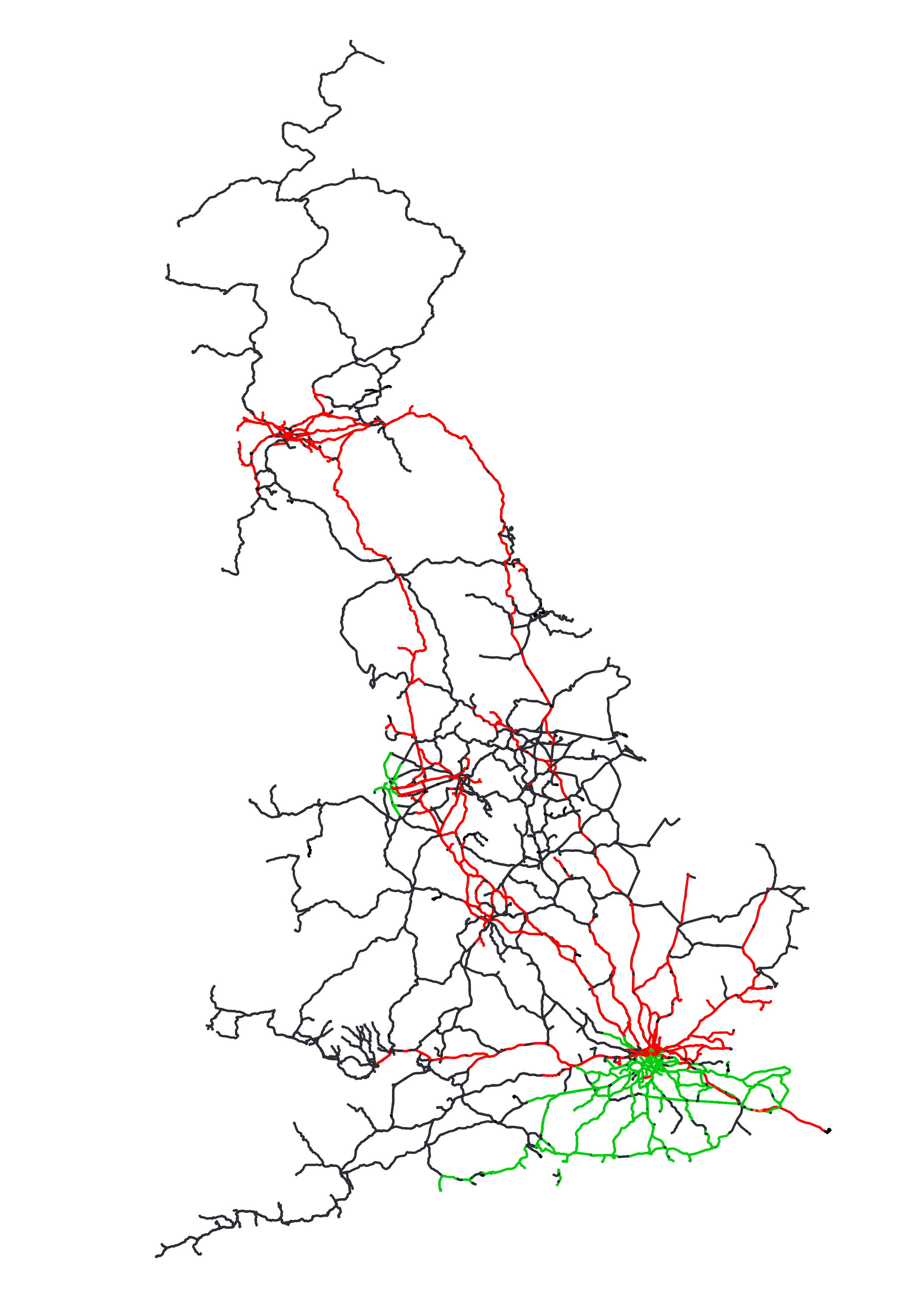
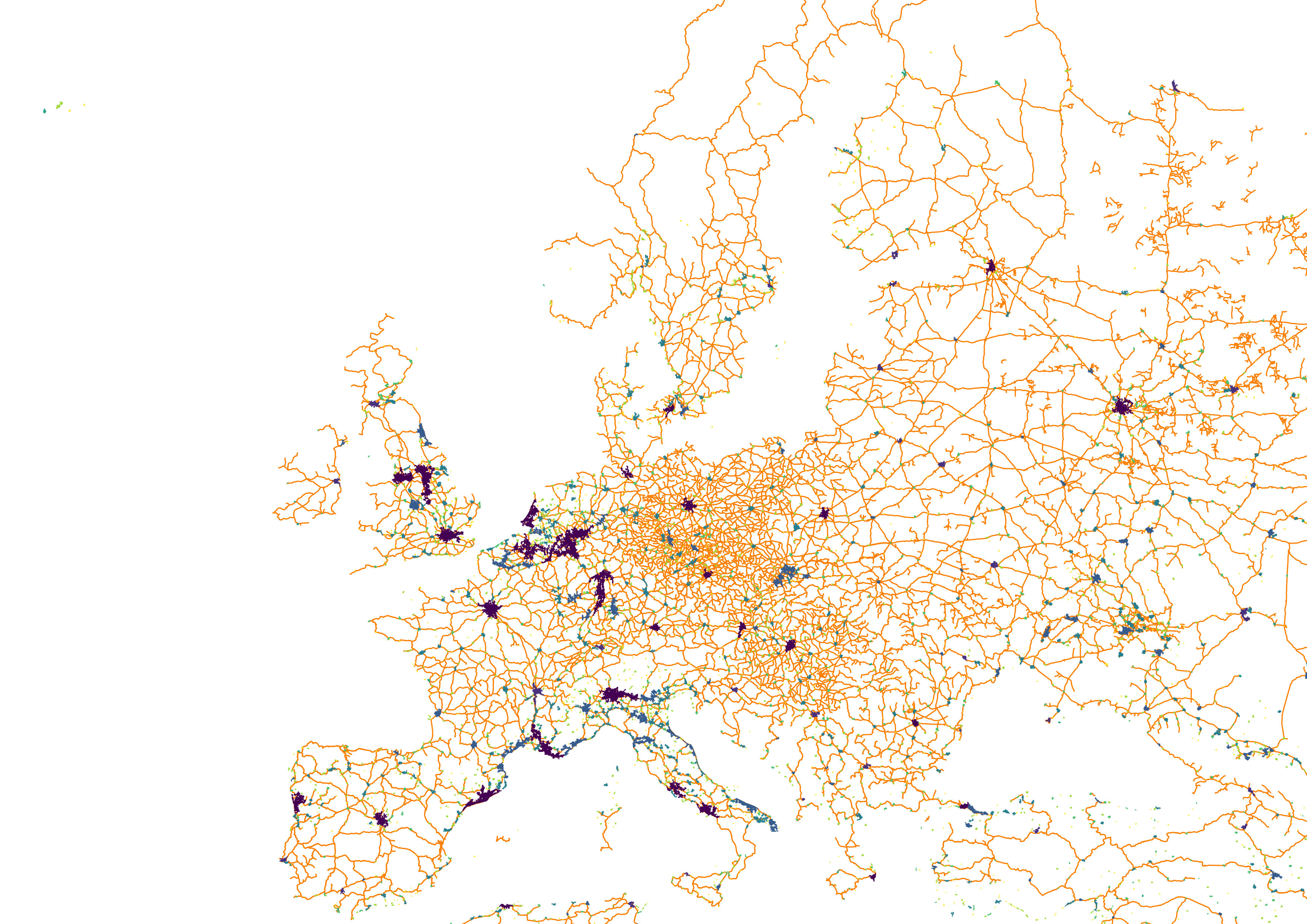
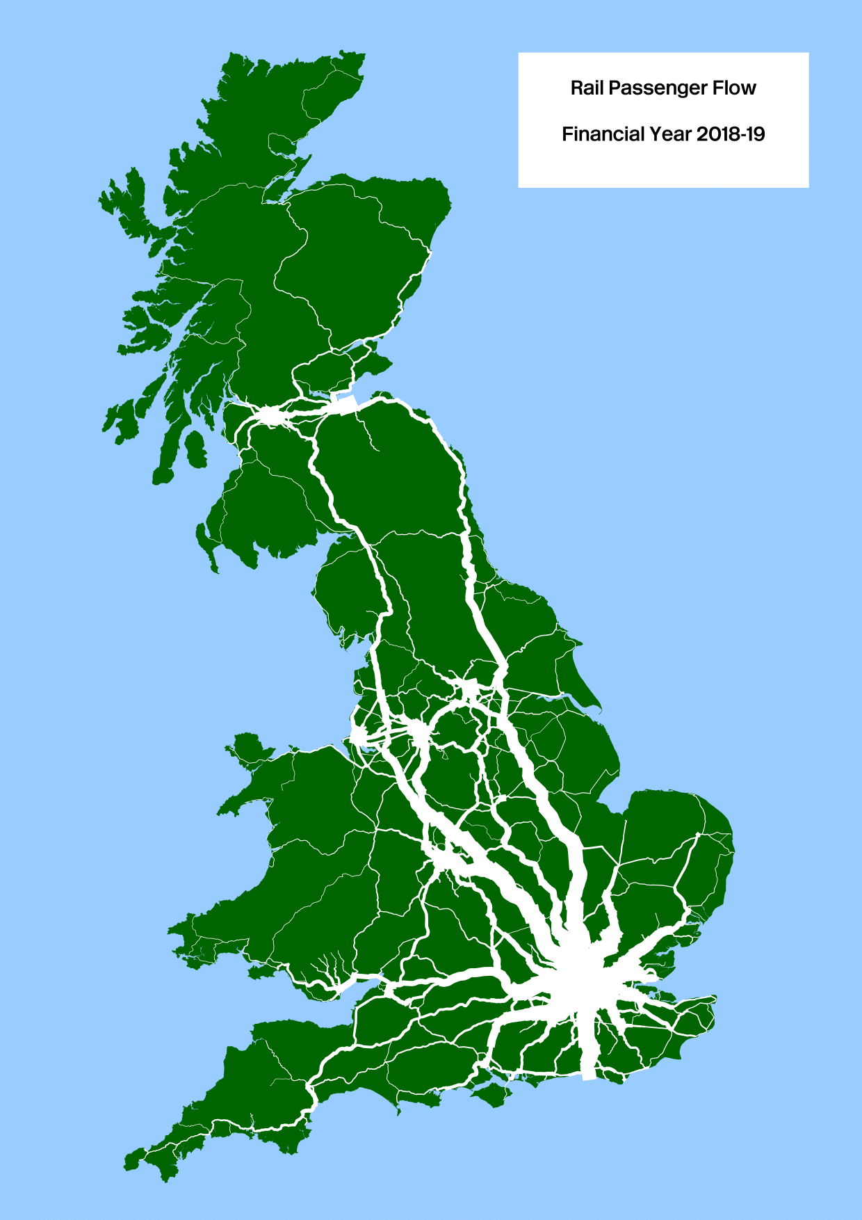
For the second #30MapsInAMonth here is a map showing the heavy-rail network track-model and stations centred on the East Coast Mainline between South Yorkshire and the Fens. This uses the Rail Data Marketplace centre-line track-model published by Network Rail and the Office of Road and Rail (ORR) list of active stations.
#rail #network #stations #30DayMapChallenge #EveryoneHomeSafeEveryDay
As I then said at the time:
I’m never sure about this, but this year I decided to prepare for the #30DayMapChallenge by looking at things I have mapped over the years. My conclusion is I suffer from a rather myopic approach to the topic I visualise… #rail #Infrastructure #population #Europe
Followed by the revelation that there was a bit more to this than I had thought:
I’ve now discovered that there are meant to be “themes” for each day in the #30DayMapChallenge but as that’s beyond me, it looks like I will be running a #fringe event instead…
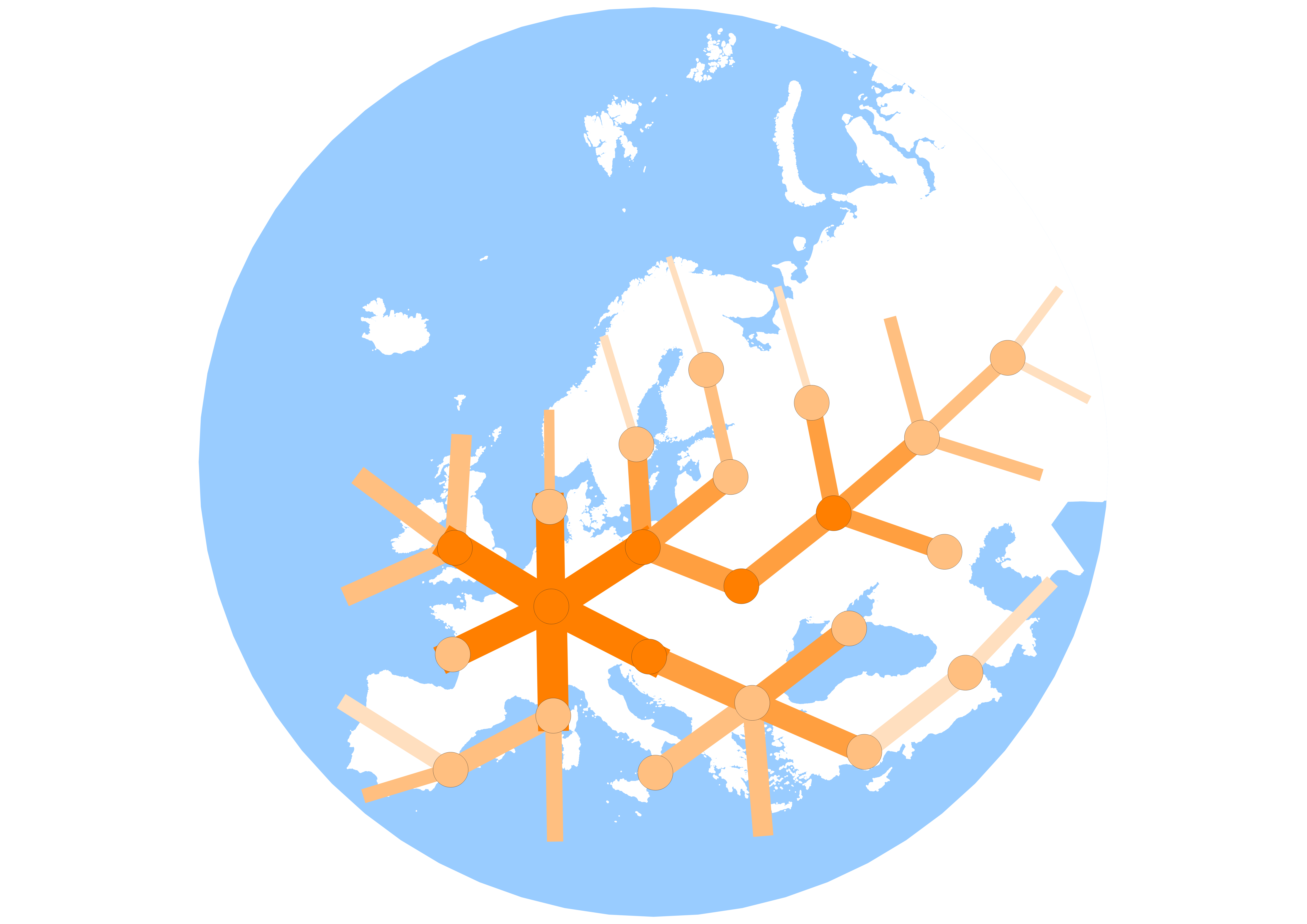
For the third #30MapsInAMonth are three theoretical European full-automated luxury high-speed heavy-rail network maps based on population distribution. This uses H3 hierarchical hexagon library to aggregate WorldPop population data into #polygons, creating a maximum spanning tree network using population-to-population edge-weights and names for major urban centres added using EUCommission Global Human Settlement Layer data.
#rail #network #HighSpeedRail #stations #30DayMapChallenge
For the fourth #30MapsInAMonth is a map also based on population distribution and the shortest walking route to routes from the 2021 Office for National Statistics census Output Area locations to the stations centred on Sheffield. The line width is proportional to the aggregated population and the routes are based on based on OpenStreetMap path data, and the station locations on Office of Rail and Road (ORR) active station list
#rail #network #hinterland #stations #30DayMapChallenge
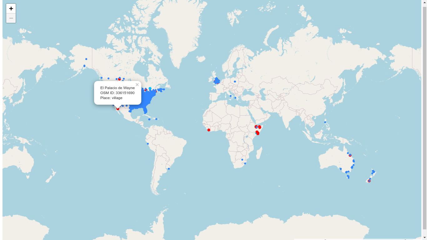
For the fifth #30MapsInAMonth is a map global map of places called “Wayne” based on #OpenStreetMap. It is arguably both “Waynes World” and my most “excellent” map.
#PlaceNames #world #map #30DayMapChallenge
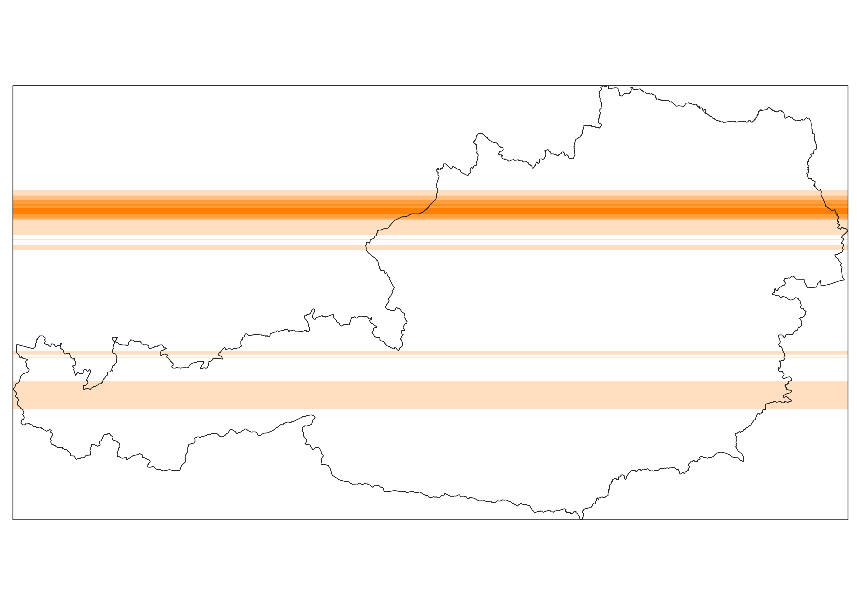
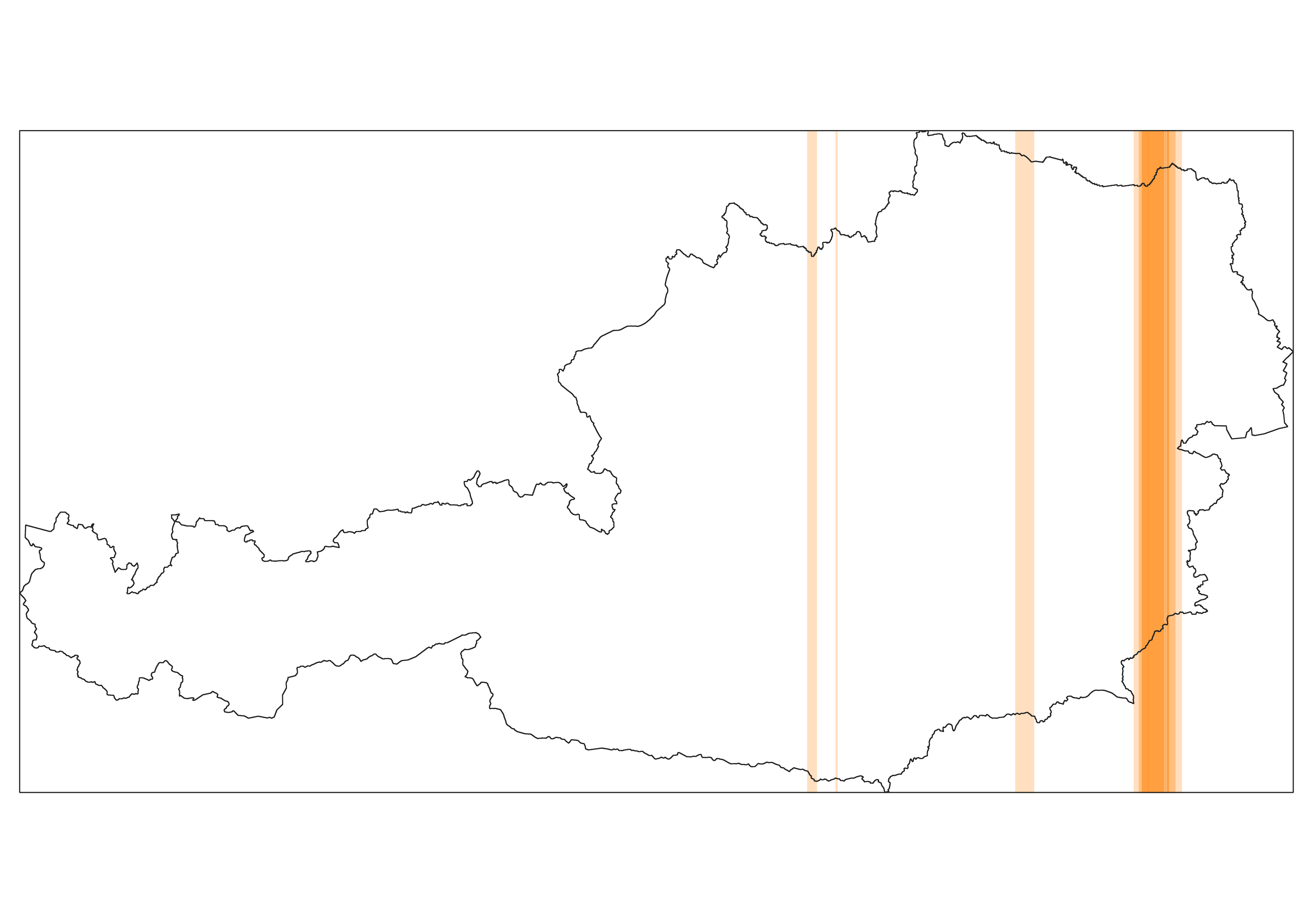
For the six #30MapsInAMonth are two maps the one-dimensional population distribution of Austria. Aggregating WorldPop population and country boundary data, based in 100m slices, this shows the relative population distribution in the horizontal and vertical points on the compass.
#population #Austria #30DayMapChallenge #OpenData
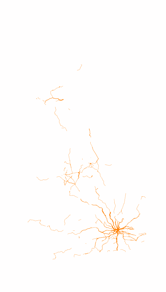
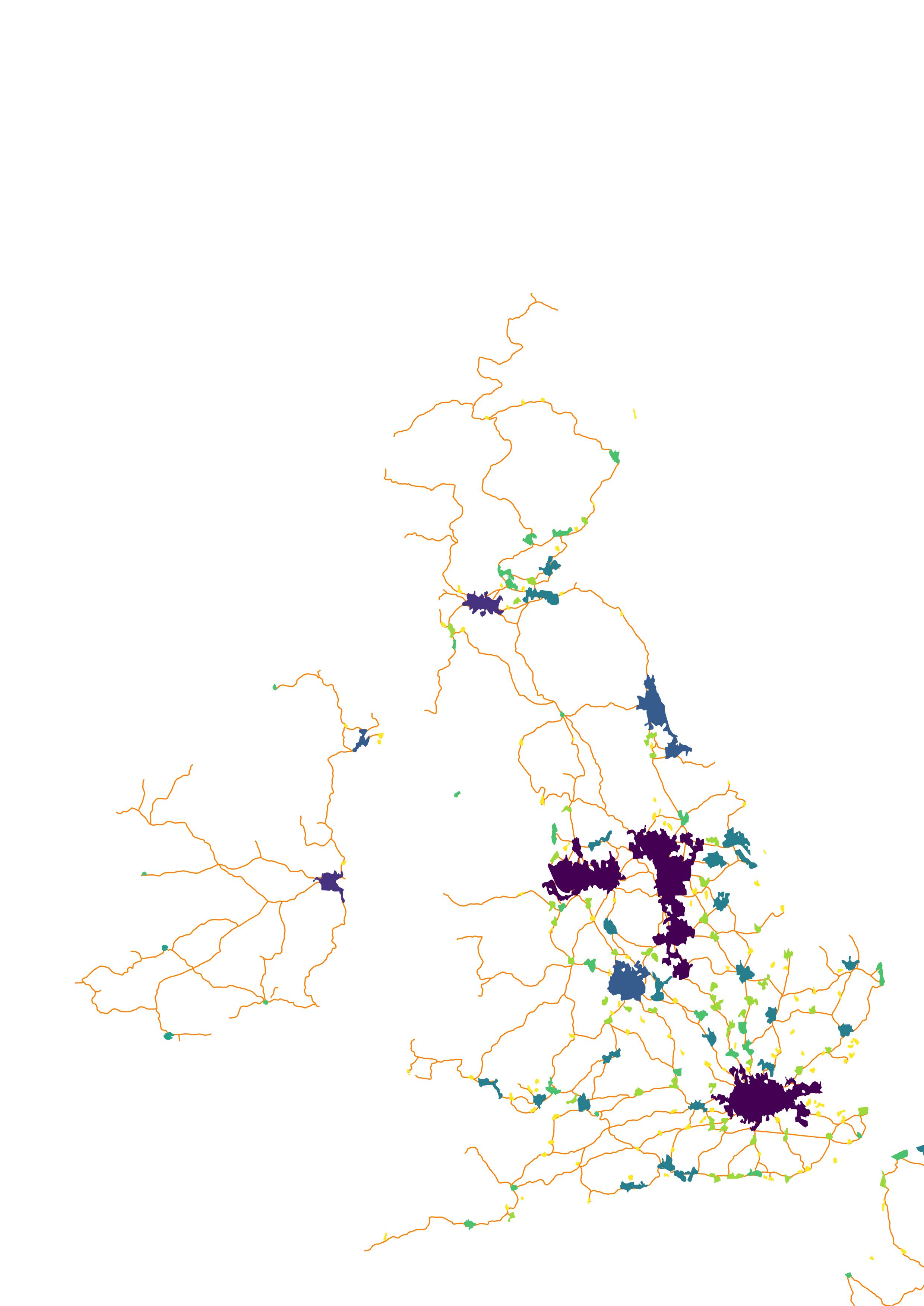
For the seventh #30MapsInAMonth are two maps showing the number of heavy railway services on week of 18 August 2025 for all stations within a 80km radius of the 20M Northern population centred around Leek in Staffordshire and the 22M South Eastern population centred on London.
#rail #PublicTransport #train #services #OpenData
This was created using the Network Rail Common Interface File (CIF) timetable and centre-line network-model made available on the Rail Data Marketplace https://raildata.org.uk/
Although there is a similar population count within both areas there would appear to be a difference in provision of regional and urban heavy rail services between the two.
Week 2
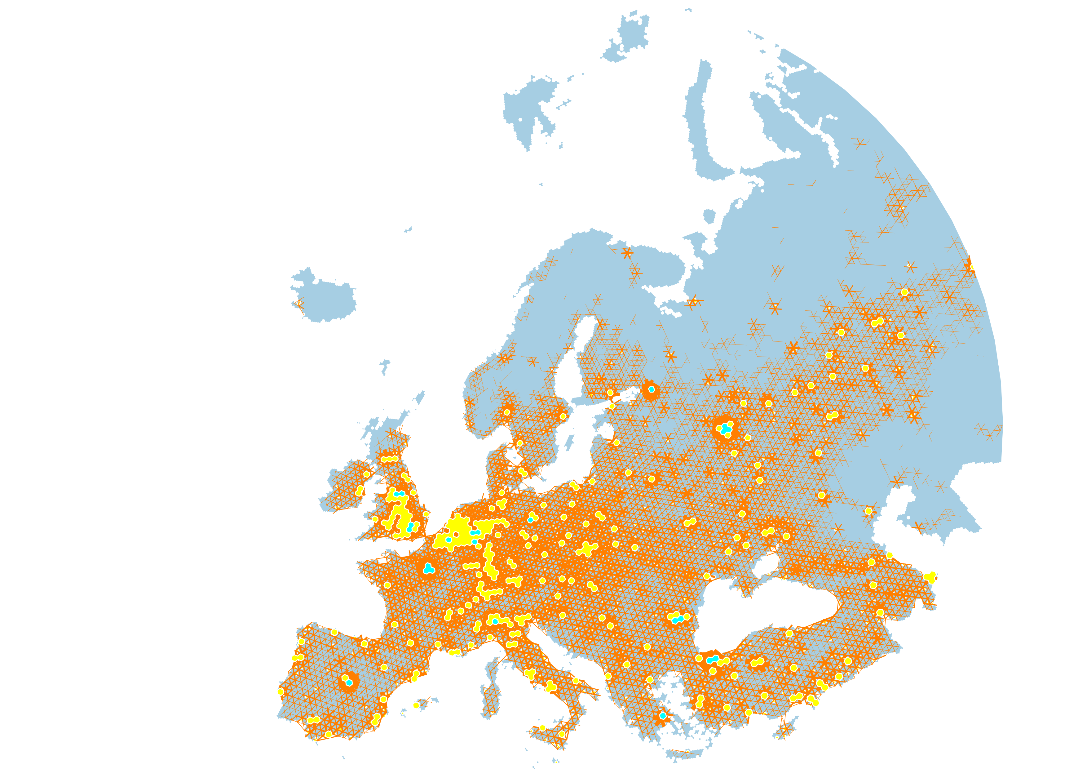
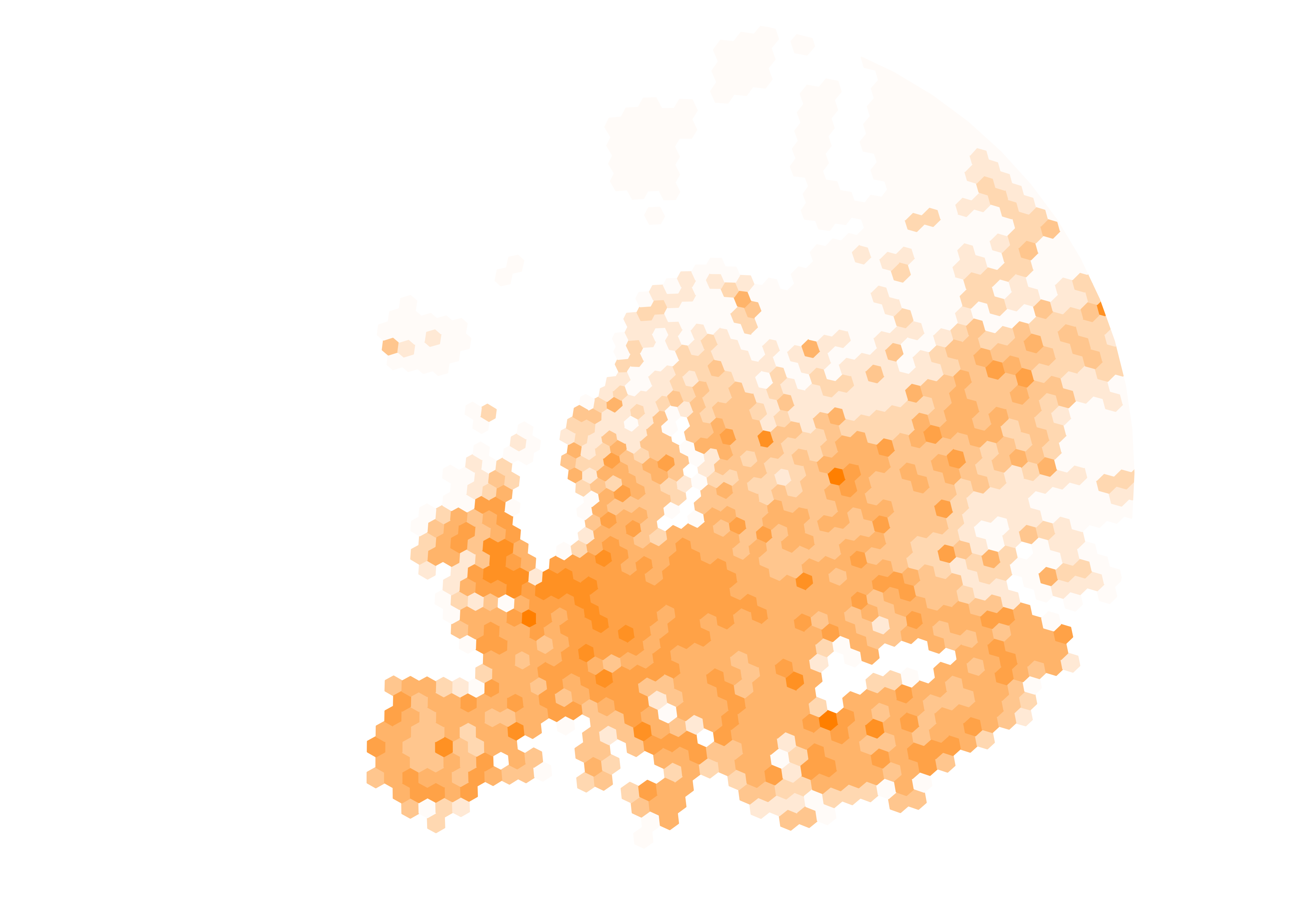
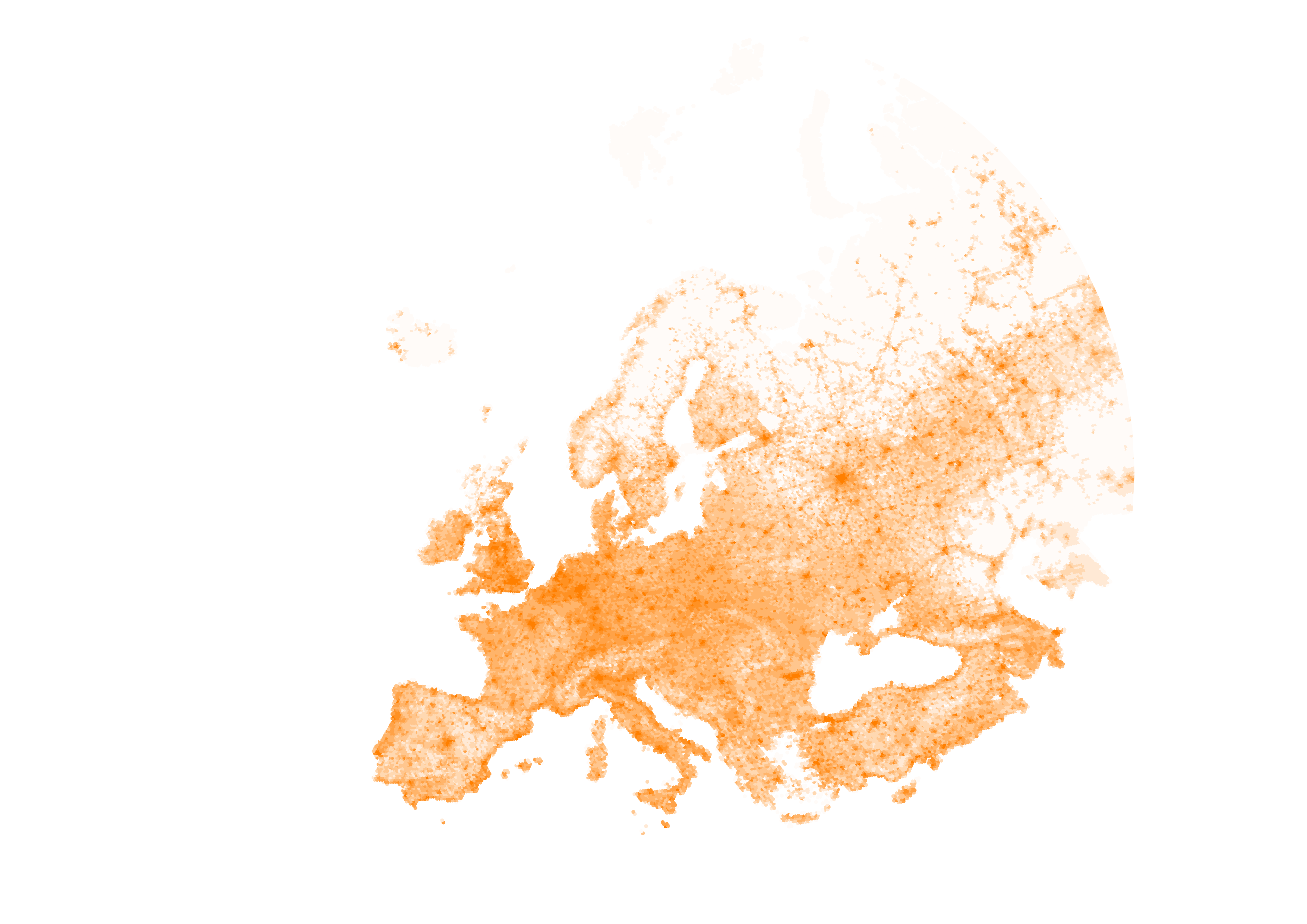
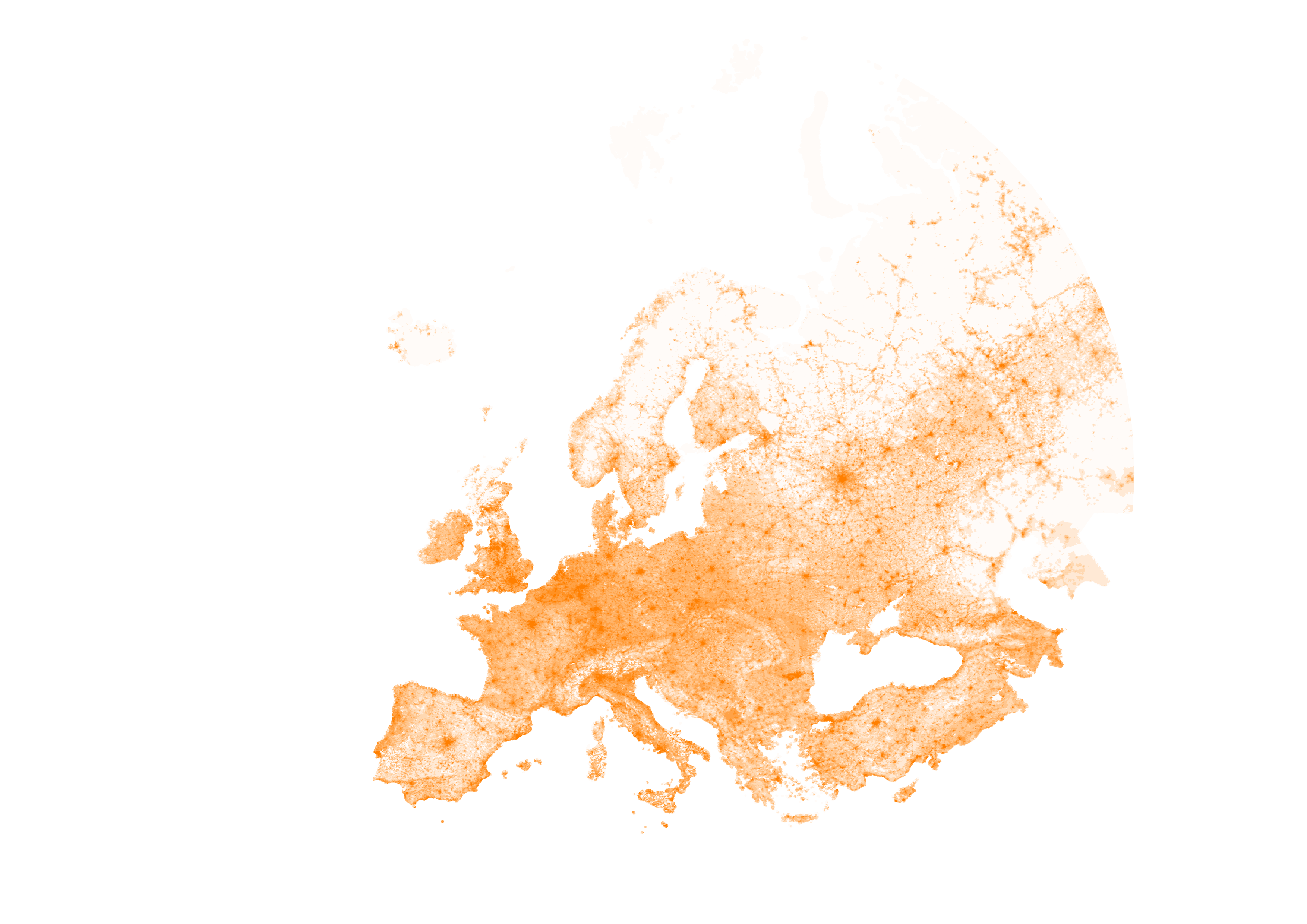
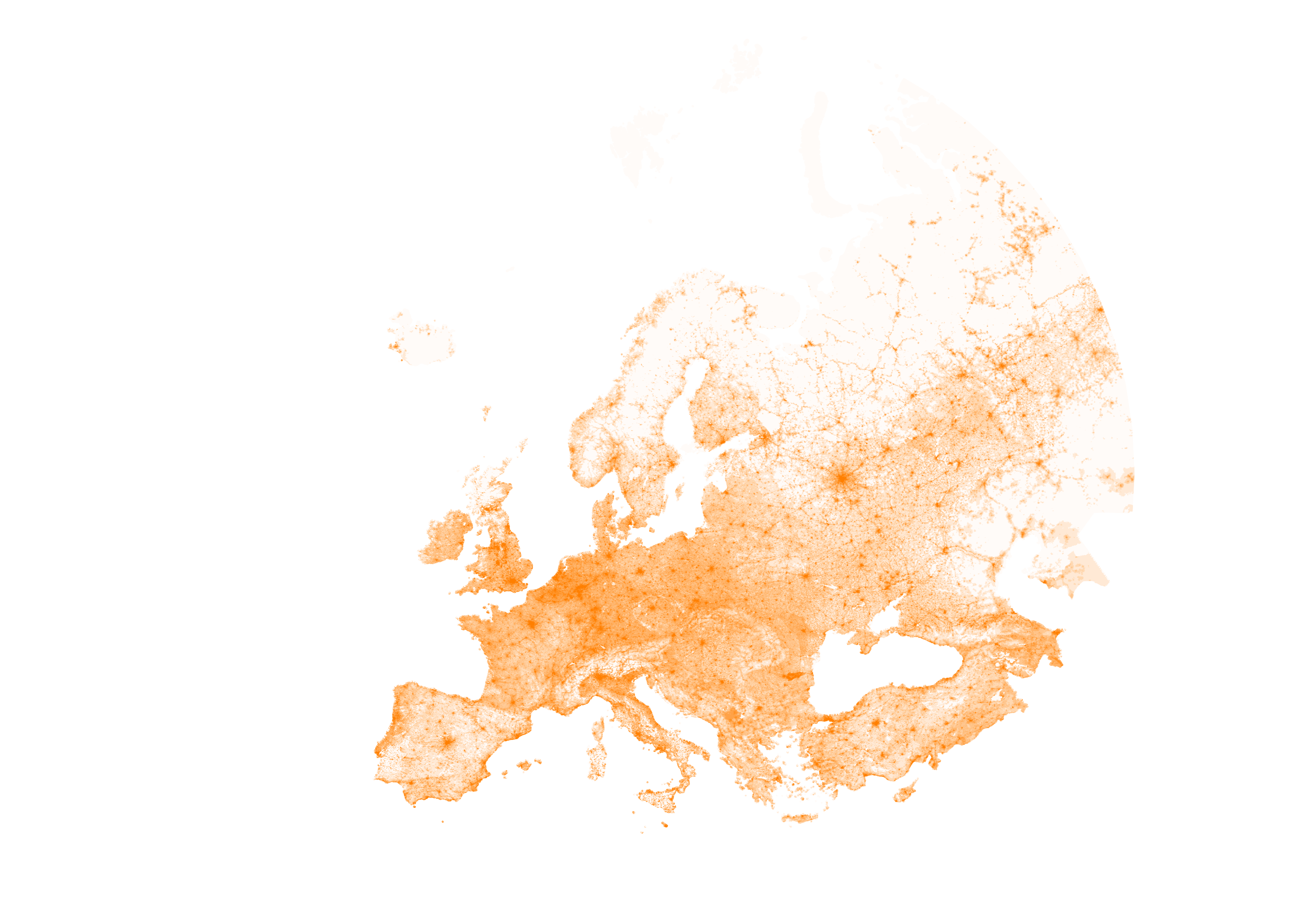
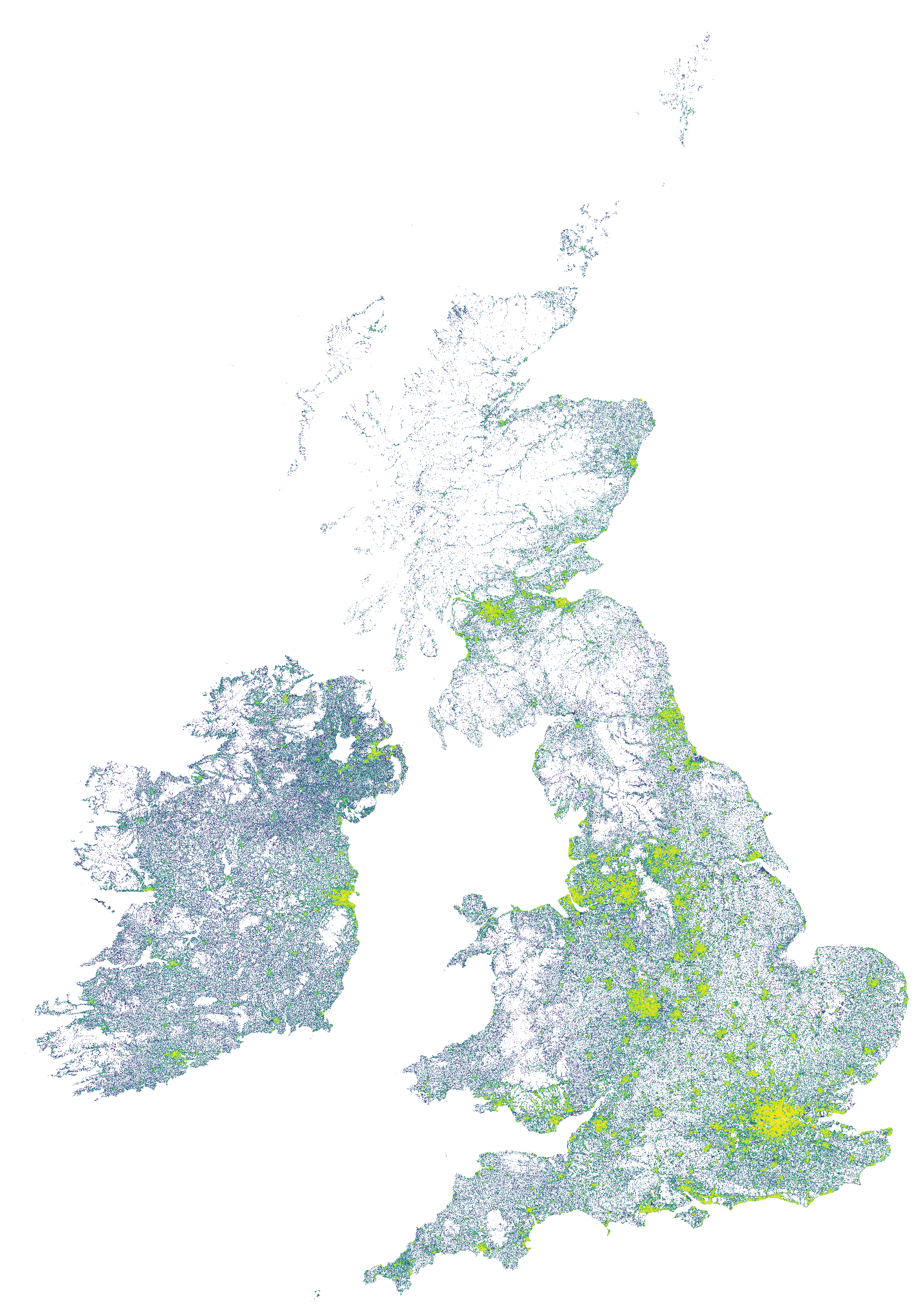
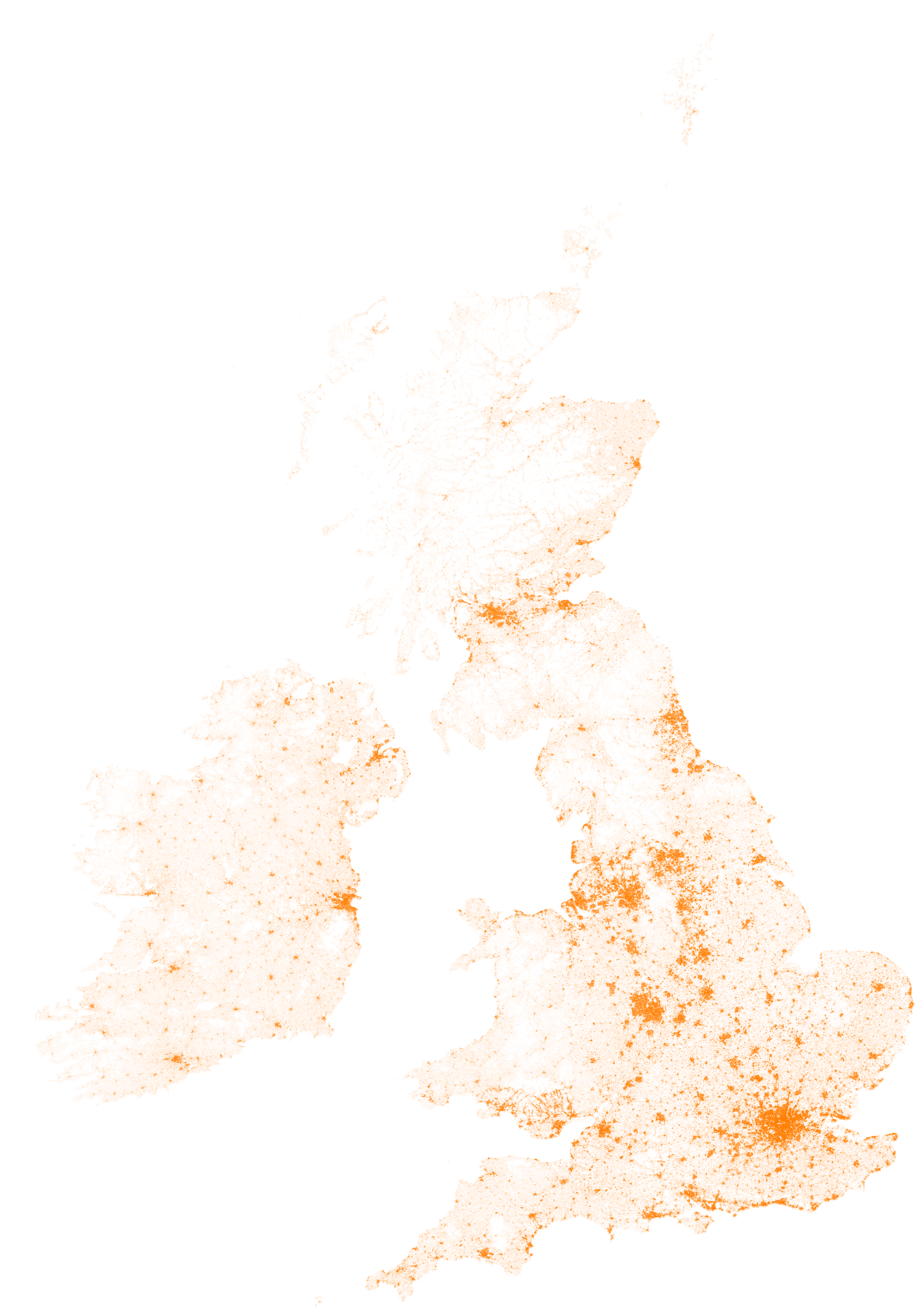
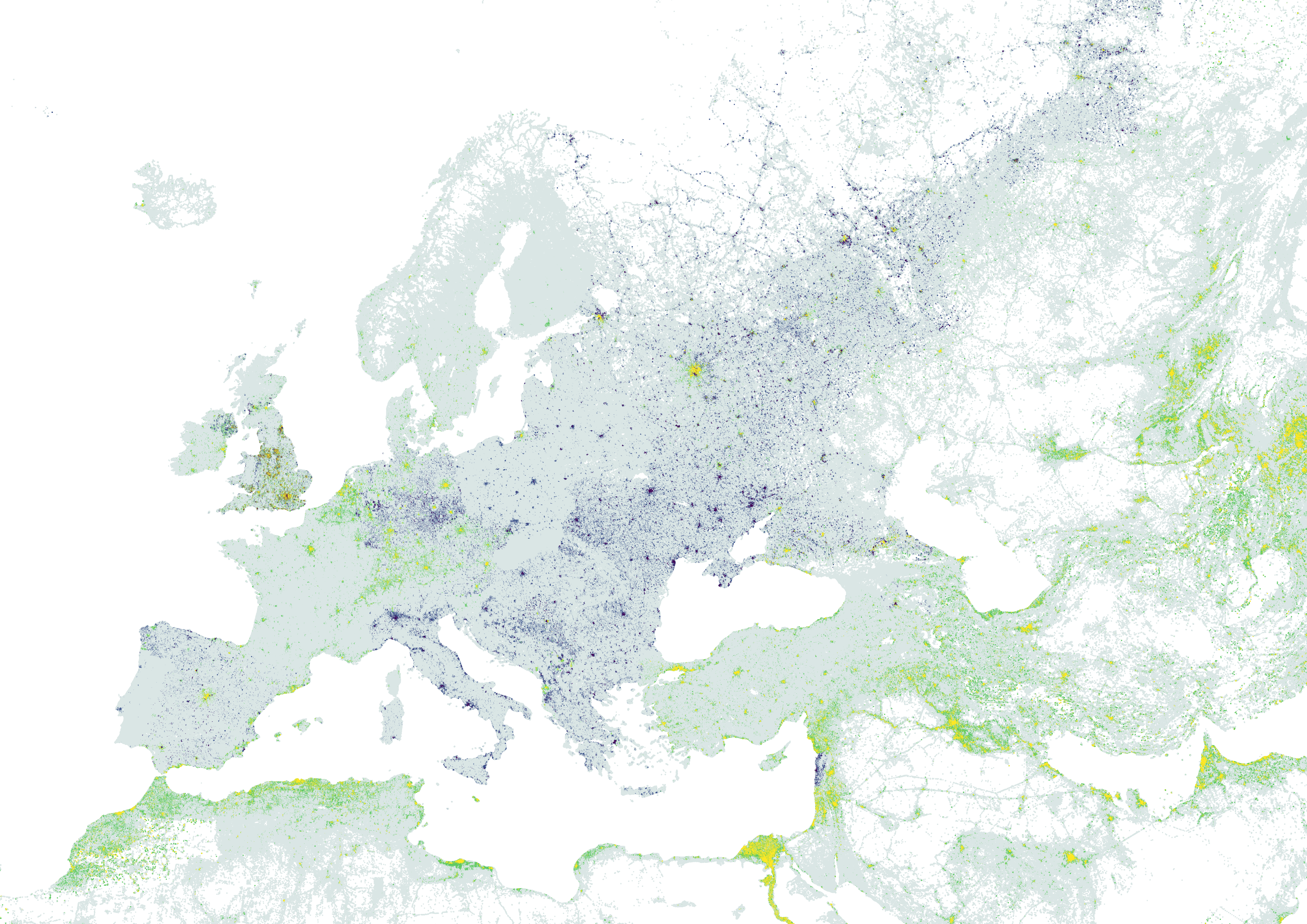
For the eighth #30MapsInAMonth maps are two maps showing the population density distribution in Europe based on the WorldPop 1km2 populations dataset with scaled and the Global Human Settlement (GHS) data to scale labels on the diagram.
#urban #population #OpenData #30dayMapChallenge
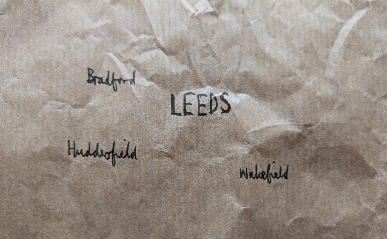
For the ninth #30MapsInAMonth is a hand drawn map of the West Yorkshire metro public transport network. This shows urban centres around Leeds in black-ink hand-script on a brown paper bag. The locations and scaling are based on the Copernicus EEA Global Human Settlement layer (GHS) data.
#urban #Leeds #OpenData #30dayMapChallenge #PublicTransport
I do wonder whether writing some names on a brown paper bag might be seen by some as a political act?
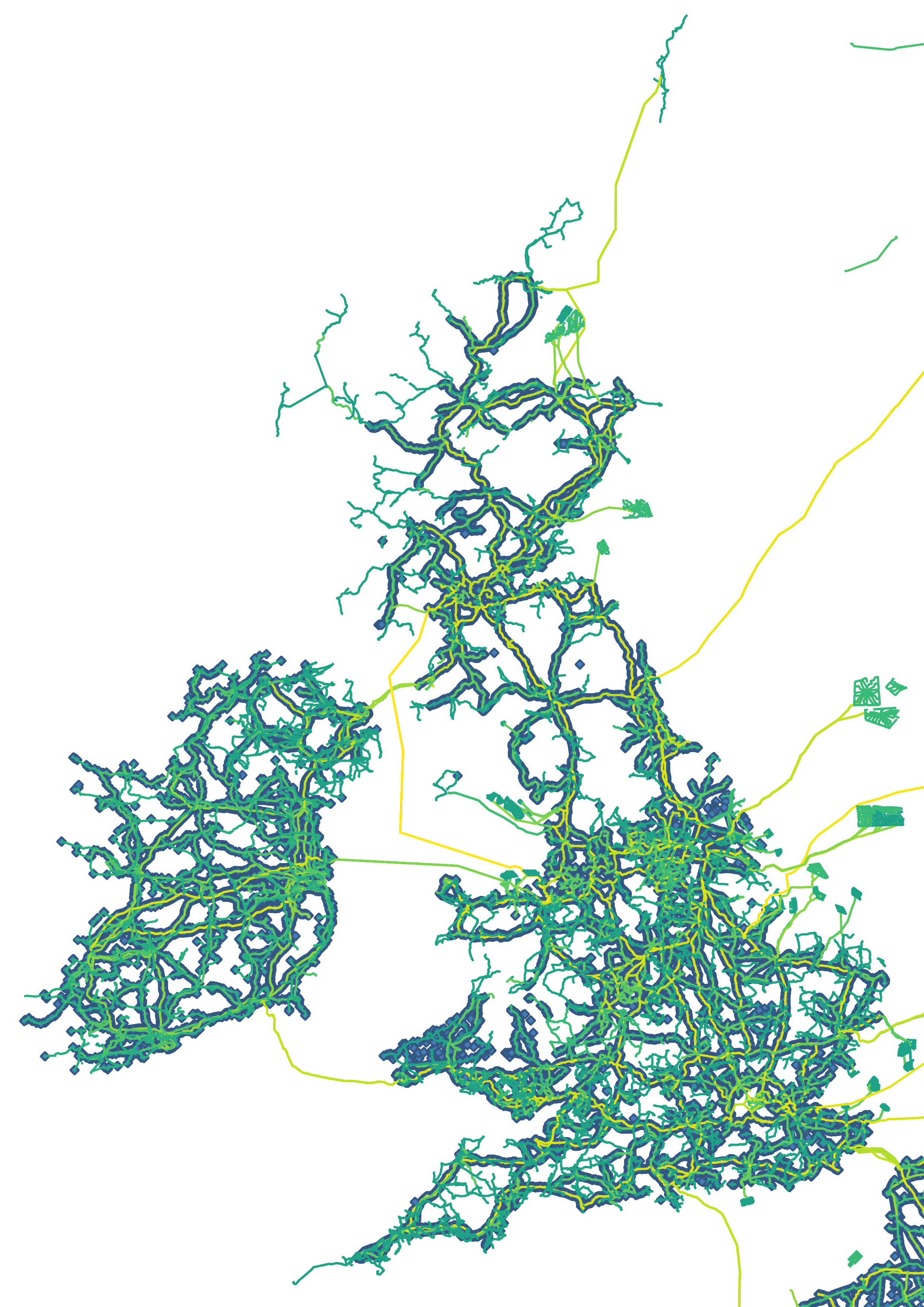
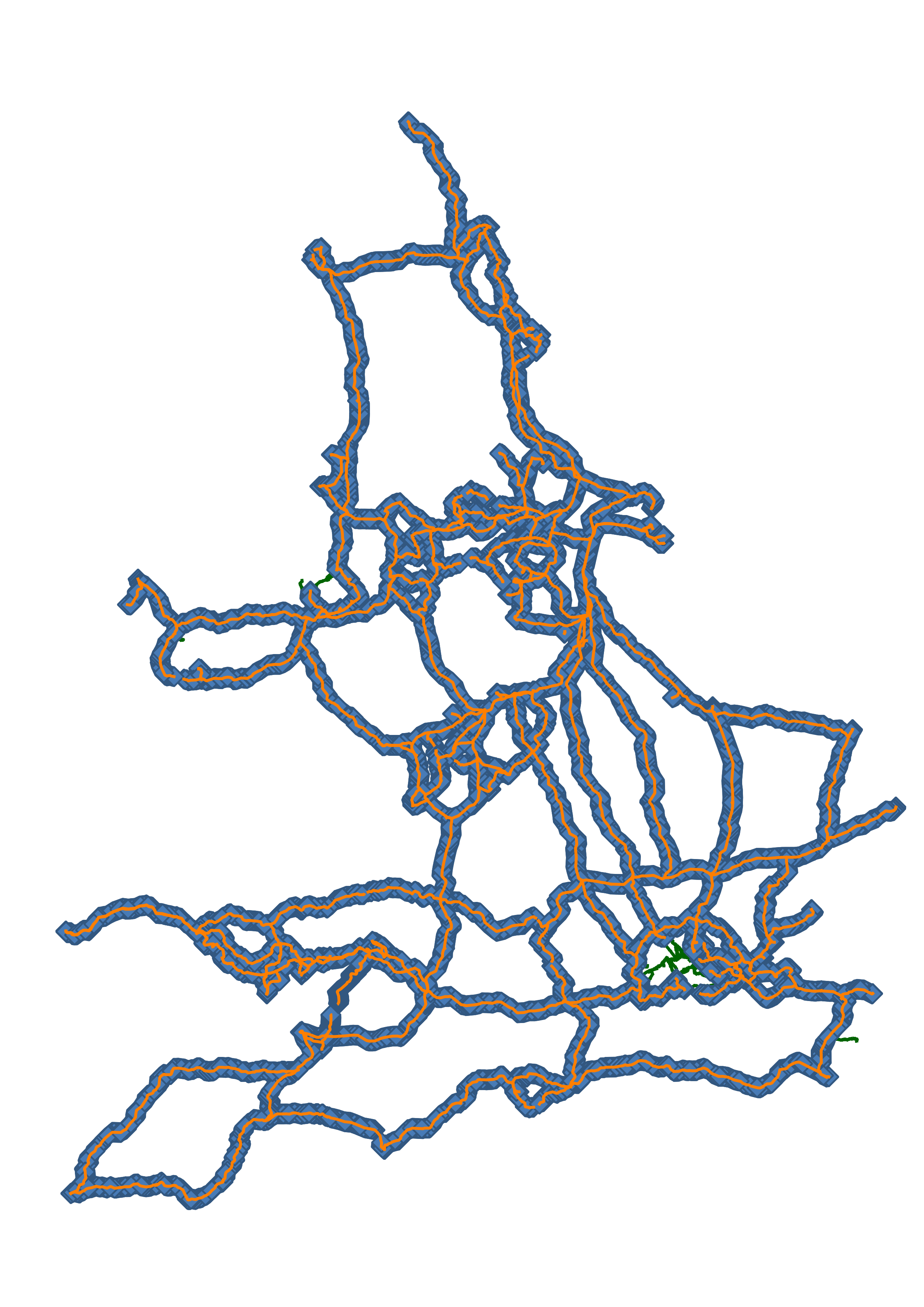
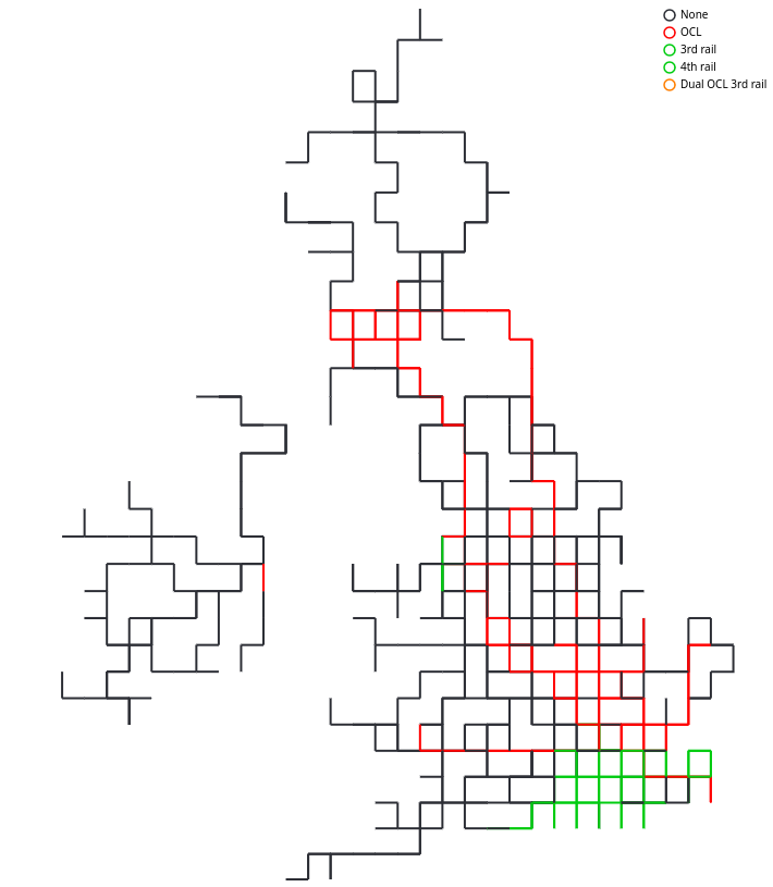
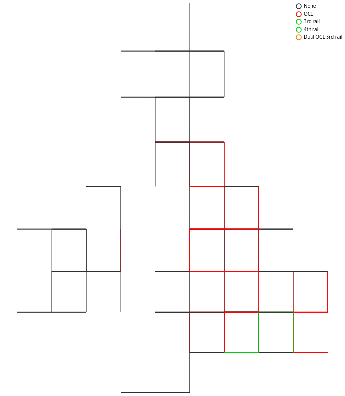
This first map doesn’t show the actual complexity of the electrification scheme in Britain as we have a myriad* of variants. Of which the majority of the network is without electrification (black), 25kV Overhead Line Electrification (OLE) (red) and 750V DC (dark green).
Unlike things to try in life, I think you should #ElectrifyAllThings but only once and with 25kV OLE.
* thanks to Garry Keenor (@25kV@mas.to) for coordinating work to clean up the electrification tags on OpenStreetMap and agreeing the colour scheme used here.
For the eleventh #30MapsInAMonth is an animated map of the British rail network showing track occupancy count for passenger train services in hour slices for the week of 18 August 2025.
This is based on the Network Rail centre-line track- or network-model and Common Interface File (CIF) format timetable file published on the Rail Data Marketplace combined with ORR and OpenStreetMap location data for timetable points.
#OpenData #30dayMapChallenge #timetable #rail #passenger
For the twelfth #30MapsInAMonth is a theoretical future public transport network for a hundred years hence. This is based on population density aggregating WorldPop population data onto 43km edge-length hexagons, creating a network flow and overlaying with Global Human Settlement (GHS) urban centre data. The different population centre colours related to different levels of urbanisation.
#OpenData #30dayMapChallenge #population #PublicTransport #passenger #future
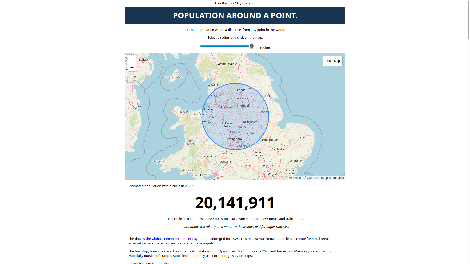
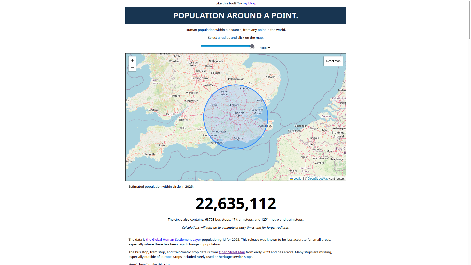
For the thirteenth #30MapsInAMonth are two short form maps based on Tom Forth’s tool that shows the population within a 100km radius circle of two points in the UK: a point in the North is 20 141 911 and West London is 22 625 112. This is based on OpenStreetMap Street Map data and Global Human Settlement (GHS) EU Global Human Settlement (GHS) layer centre data.
#Population #UK #OpenData #30dayMapChallenge #NorthSouth
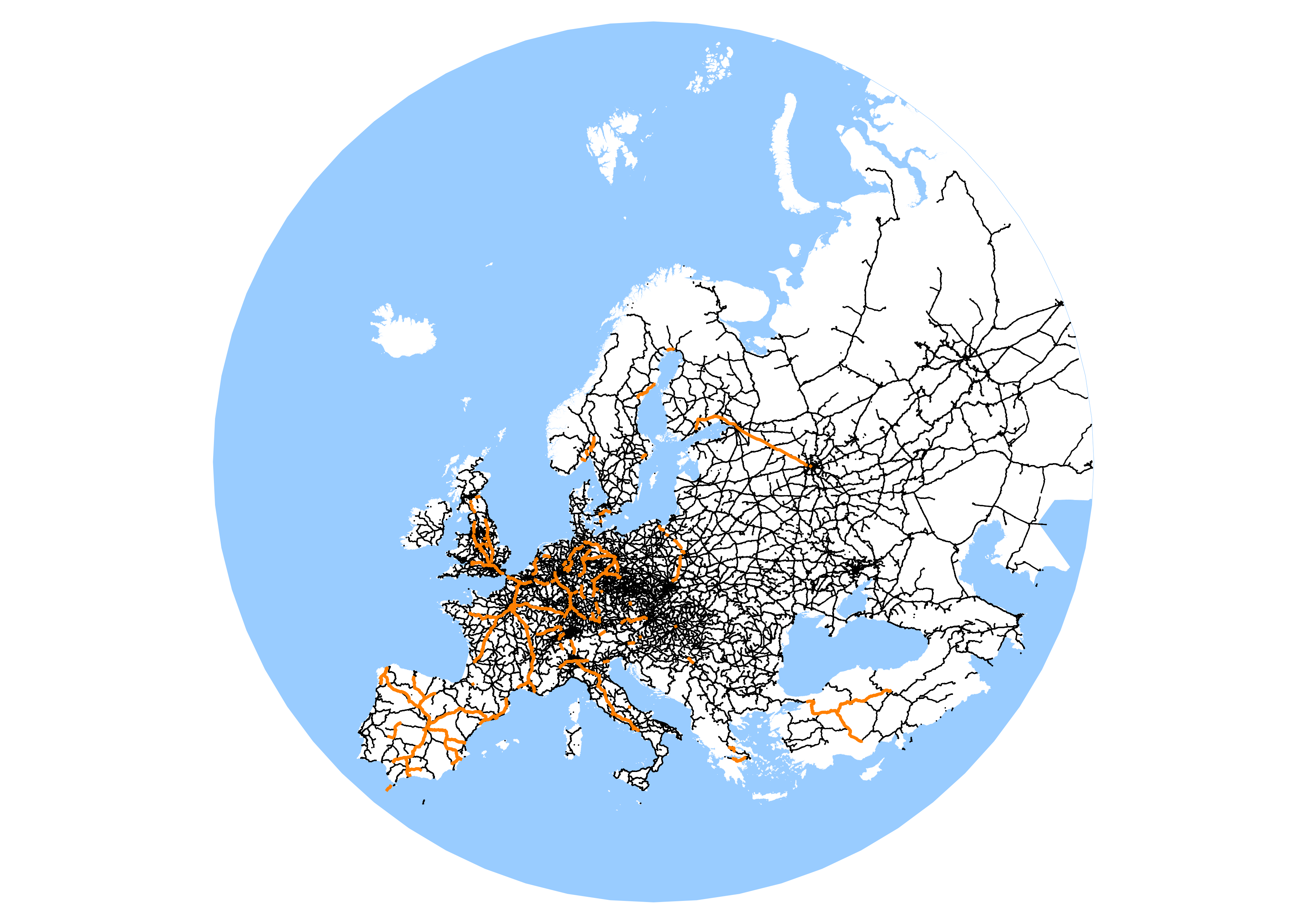
For the fourteenth #30MapsInAMonth is a map showing high-speed rail, or not, for a given value of “Europe”. This is based on line-speed from OpenStreetMap tagged data. The geography is from the WorldPop 1km2 dataset.
Week 3
Zeno all the way down
This is half-way point, the point where easy visualisations were done, 15-days left and eight* where I had no idea. Not a clue. Leaving just me and the turtles…
* “Black”, “Makeover”, “Water”, “Icons”, “Out of this World”, “A new tool”, “Cell” and “Fire” were very much WTAF
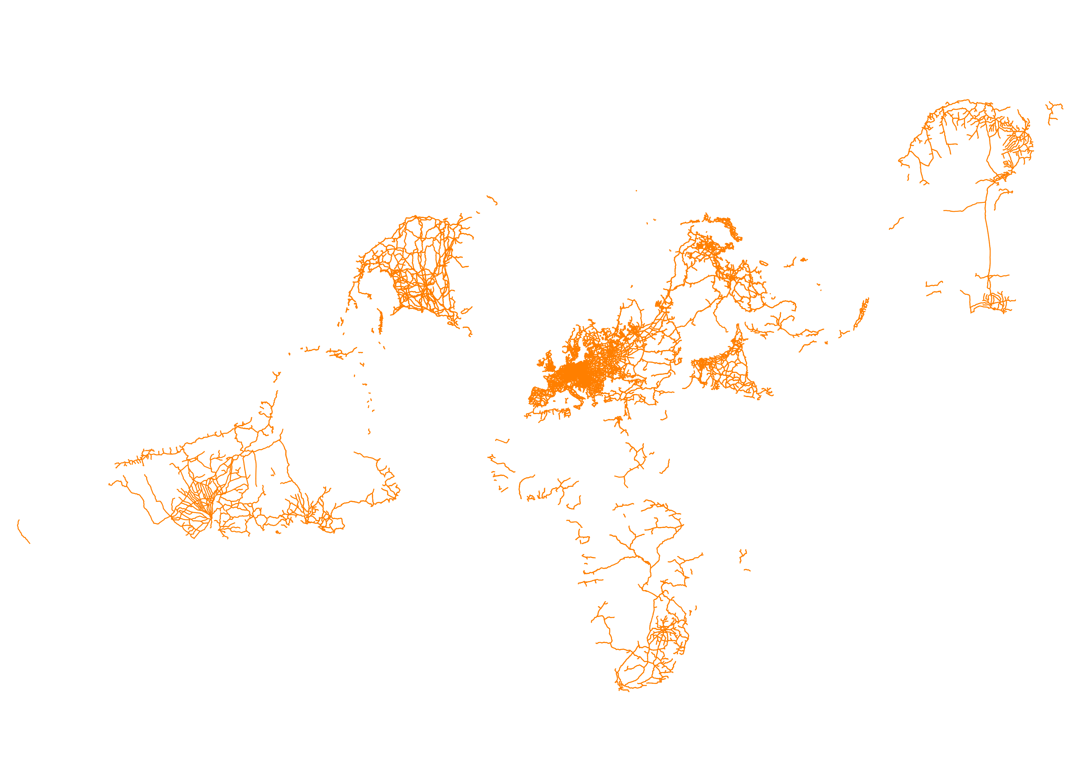
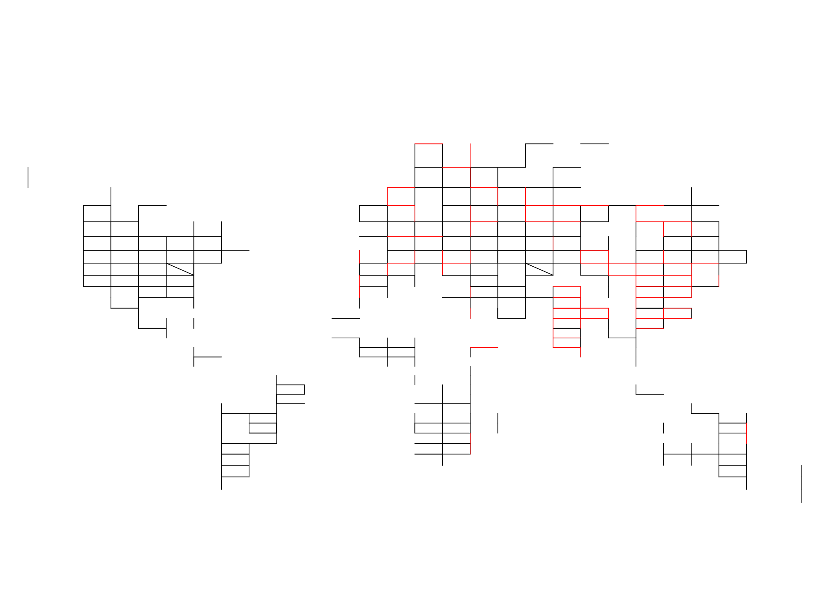
For the fifteenth #30MapsInAMonth are two sets of map for electrical power transmission mostly on the Islands of Northern Europe.
Based on OpenStreetMap, the first set show the high-voltage transmission cables and lines, and then second of these with wind-turbines.
The second set shows #OpenData from NationalGrid and Scottish and Southern Electricity Networks (SSEN) data. 1/n
#electricity #transmission #generation #Ireland #GreatBritain #30dayMapChallenge
The gap in the central belt of Scotland is because I could not find the equivalent data from the operator SP Energy Networks. If this is available, I would be happy to update the map.
For the sixteeth #30MapsInAMonth are two map showing the watershed shortest walking route to the heavy rail stations in Britian. This uses OpenStreetMap highway, road and path data for routing, scaled to show the number people who might take that path.
The first shows routes based on WorldPop 1km2 data The second shows routes based on data from the UK #Census2021
#Rail #Passenger #PublicTransport #GreatBritain #OpenData #30dayMapChallenge
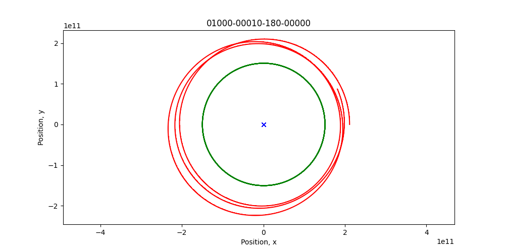
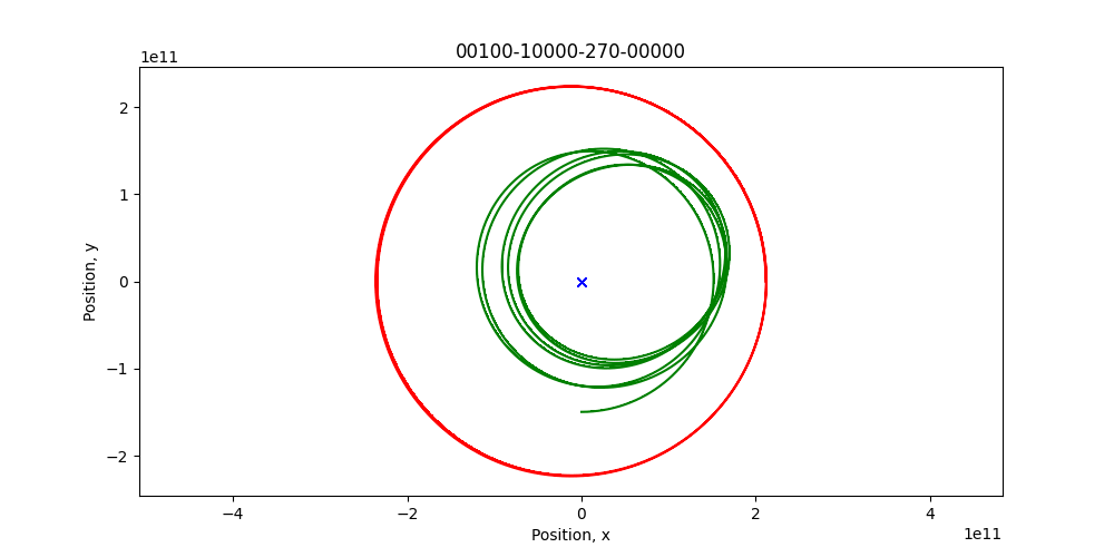
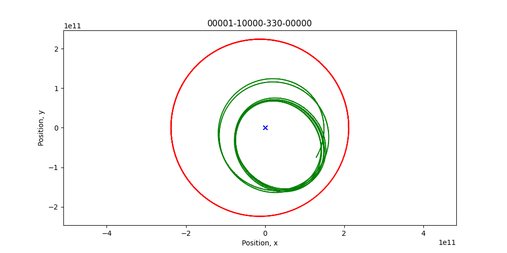
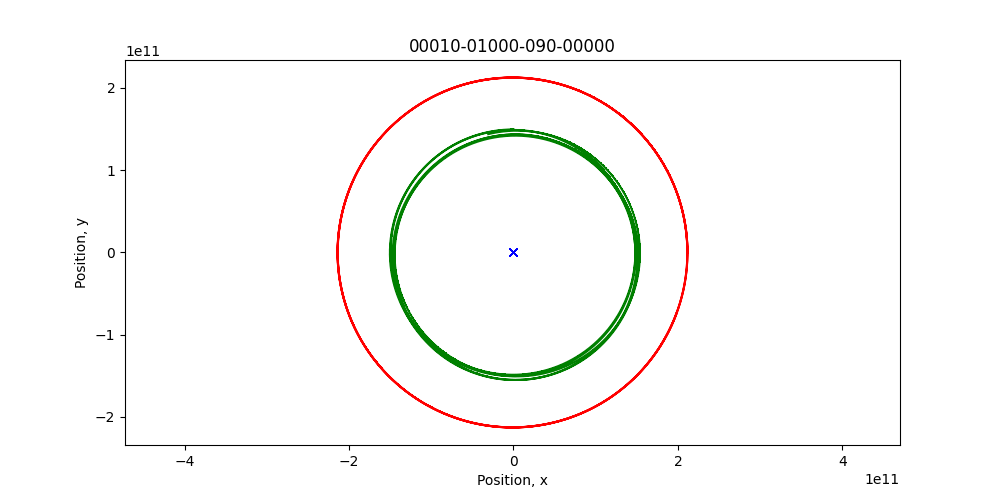
For the eighteenth #30MapsInAMonth are a set of four animated simulations of a three body solar system. Where the mass of the two planetary bodies and the initial offset angle is varied, and correspond to the three numbers at the top of the simulation.
This was inspired by my daughter’s final year degree project and, although rare, shows how you can have some things go spectacularly wrong sometimes, or not.
#Space #Modelling #Chaos #python #30dayMapChallenge
For the nineteenth #30MapsInAMonth are a set of map using different coordinate system projections of Natural Earth railway data https://www.naturalearthdata.com/
The four maps represent points on the oblate-spheroid that is the Earth on a surface. The first uses latitude and longitude in °, the rest are in meters. The second is commonly used on the web, the third a projection for Europe and the final is the UK Ordnance Survey map projection.
#rail #WorldMap #NaturalEarth #Coordinates #30dayMapChallenge
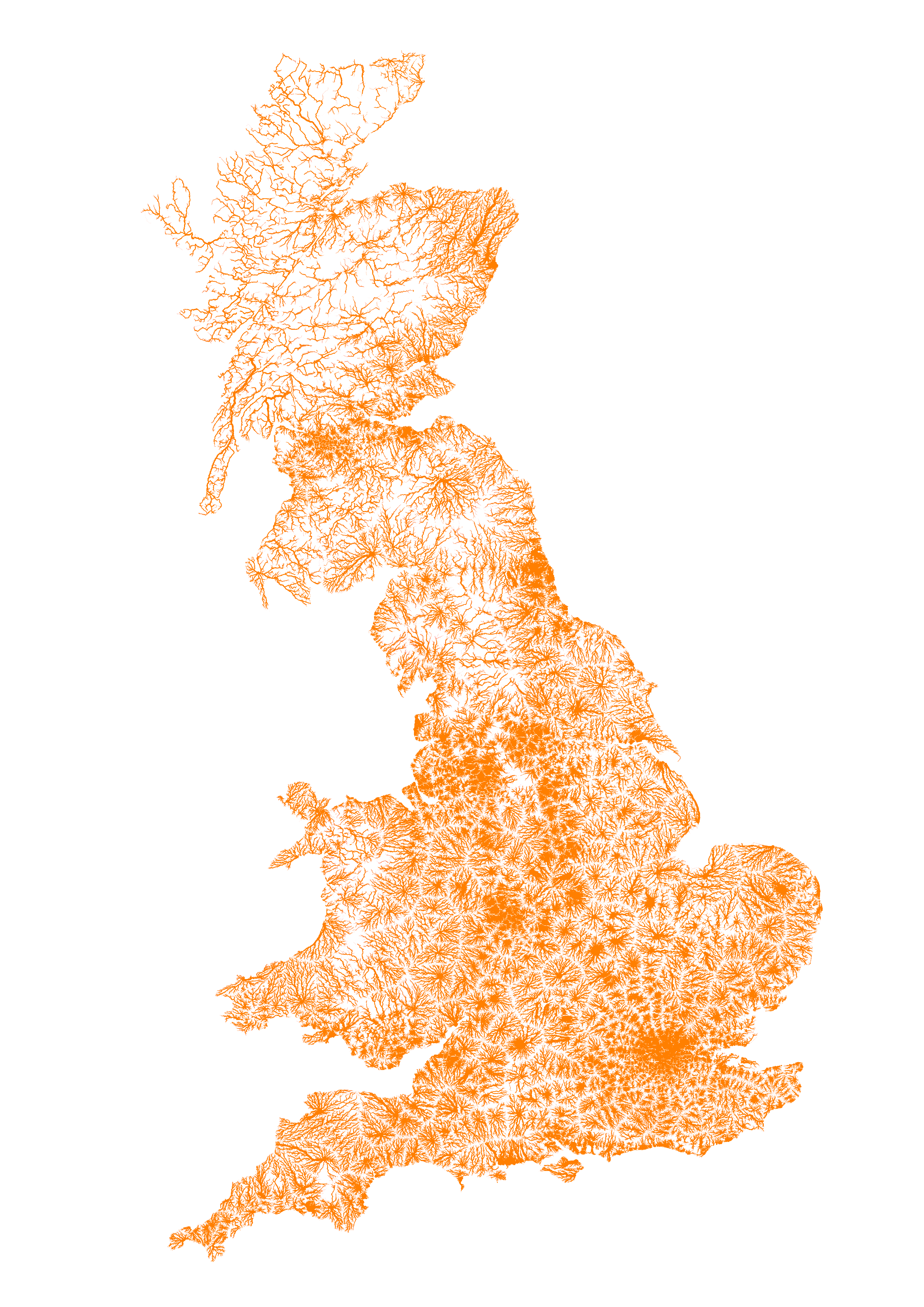
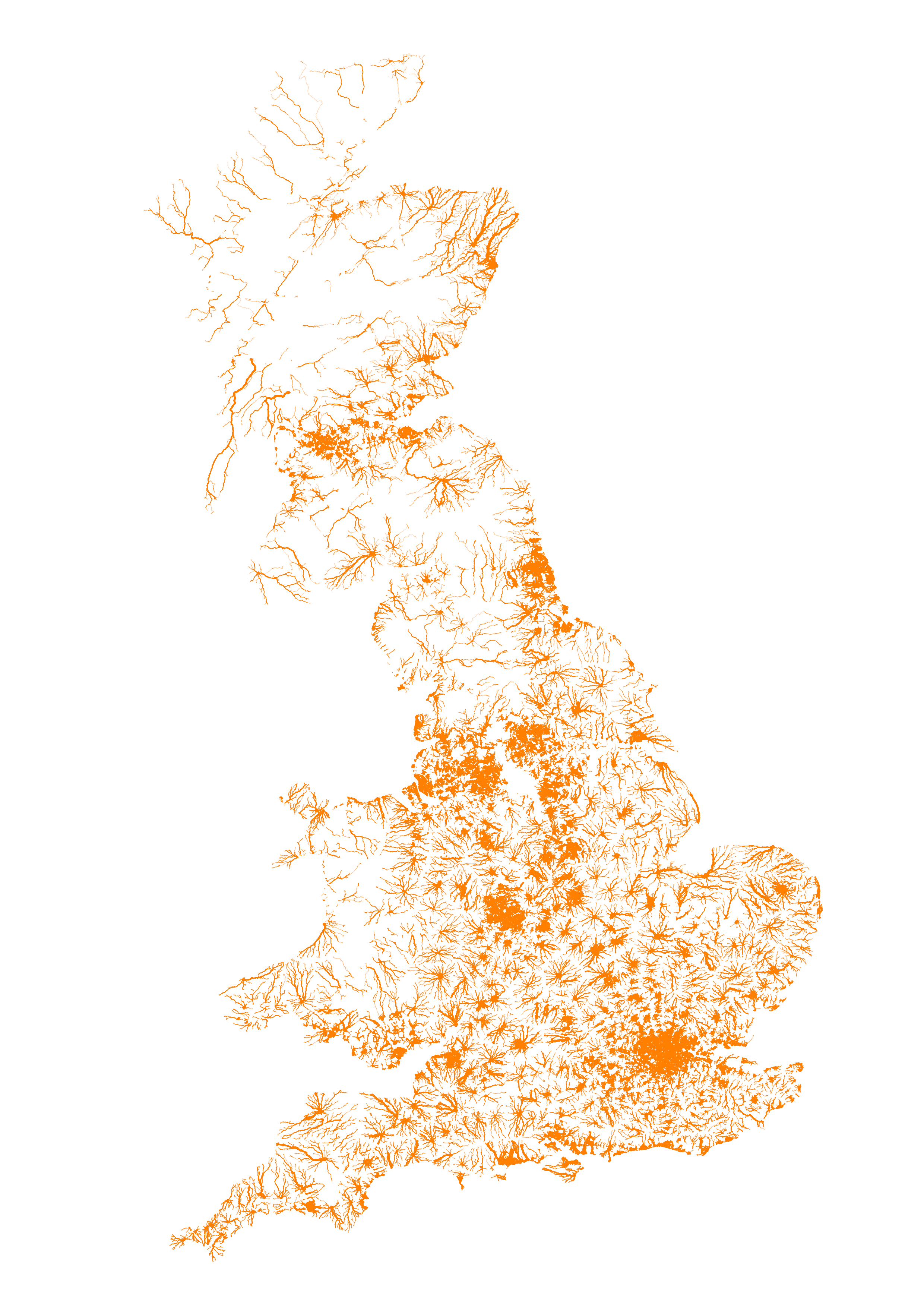
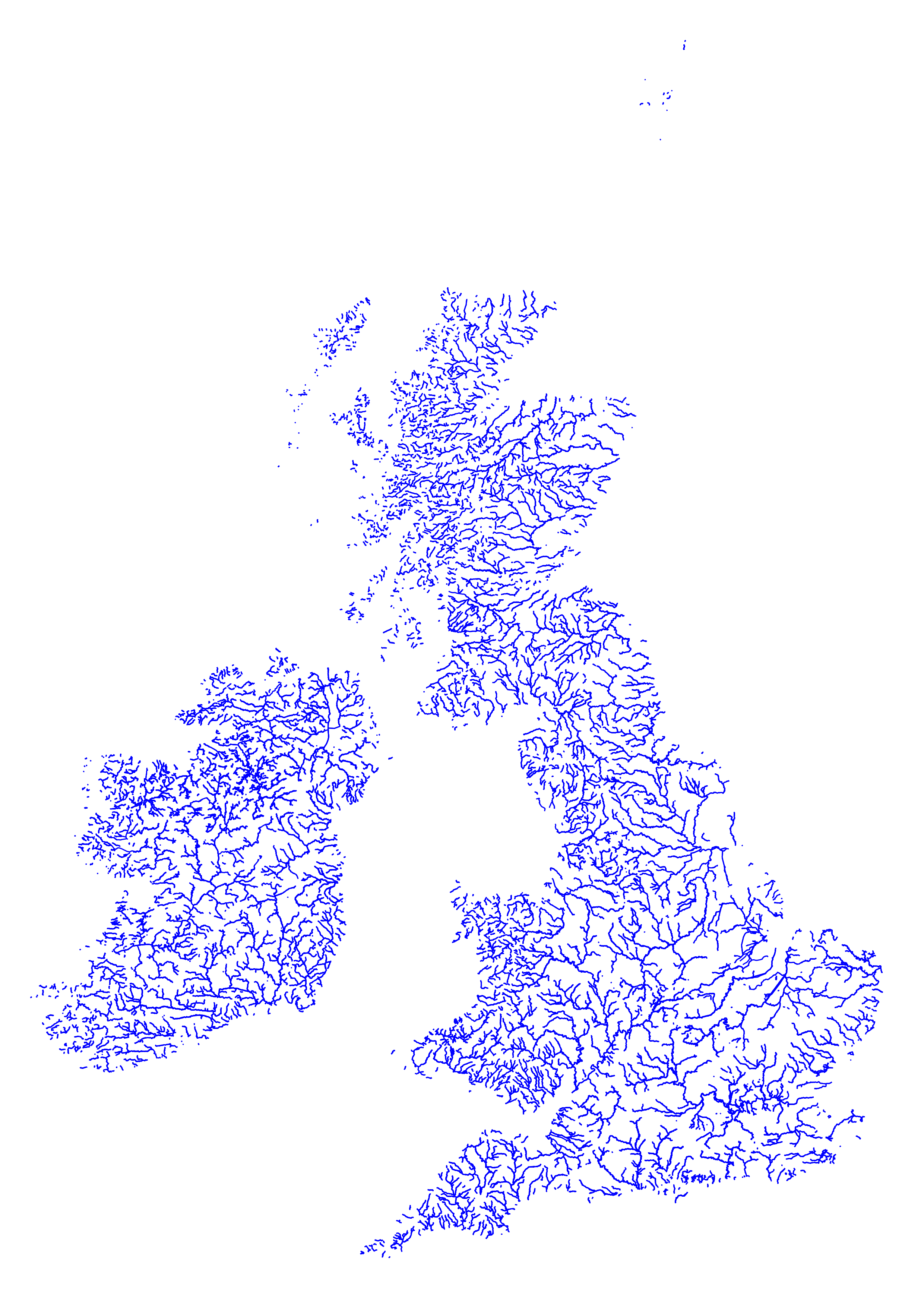
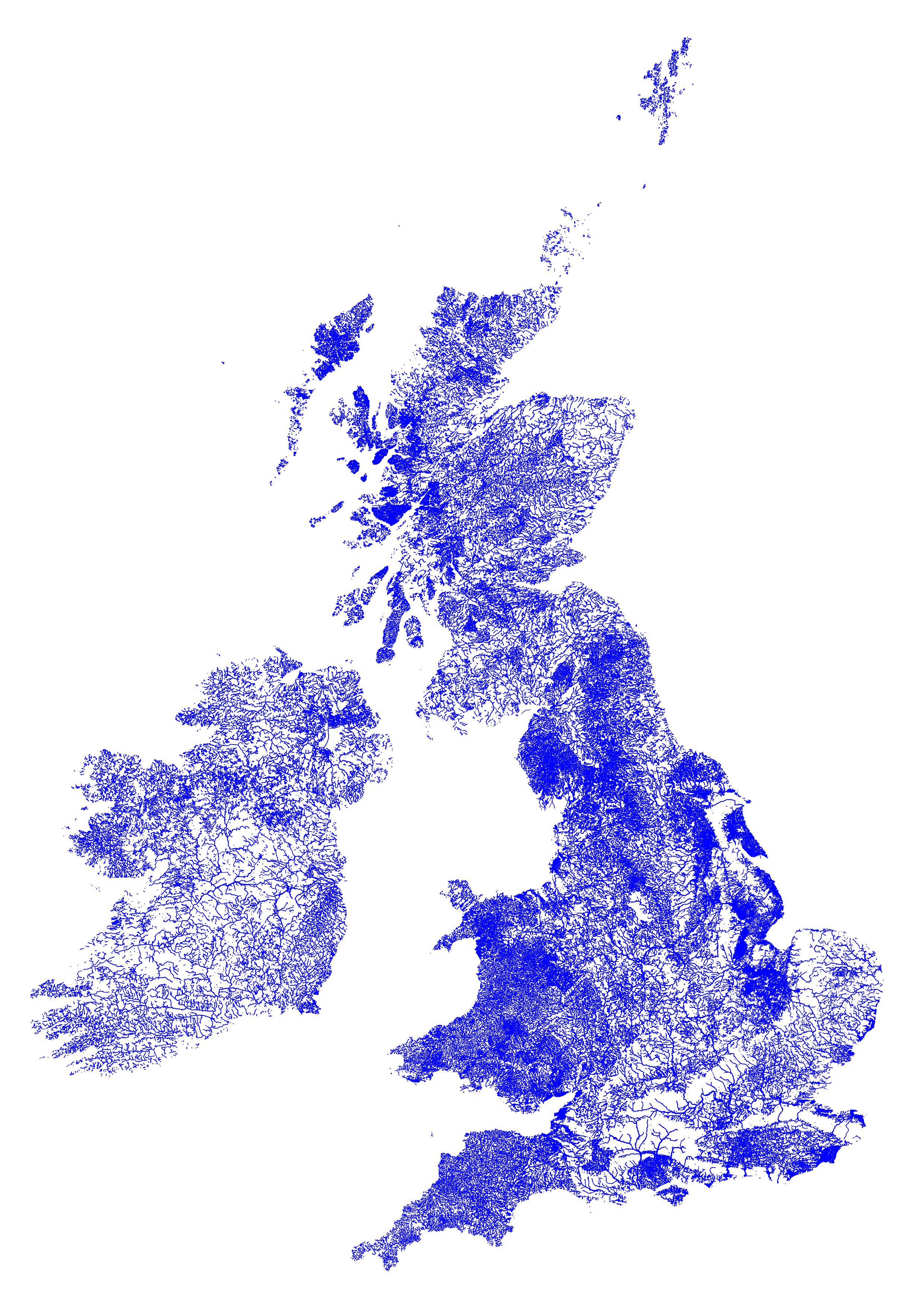
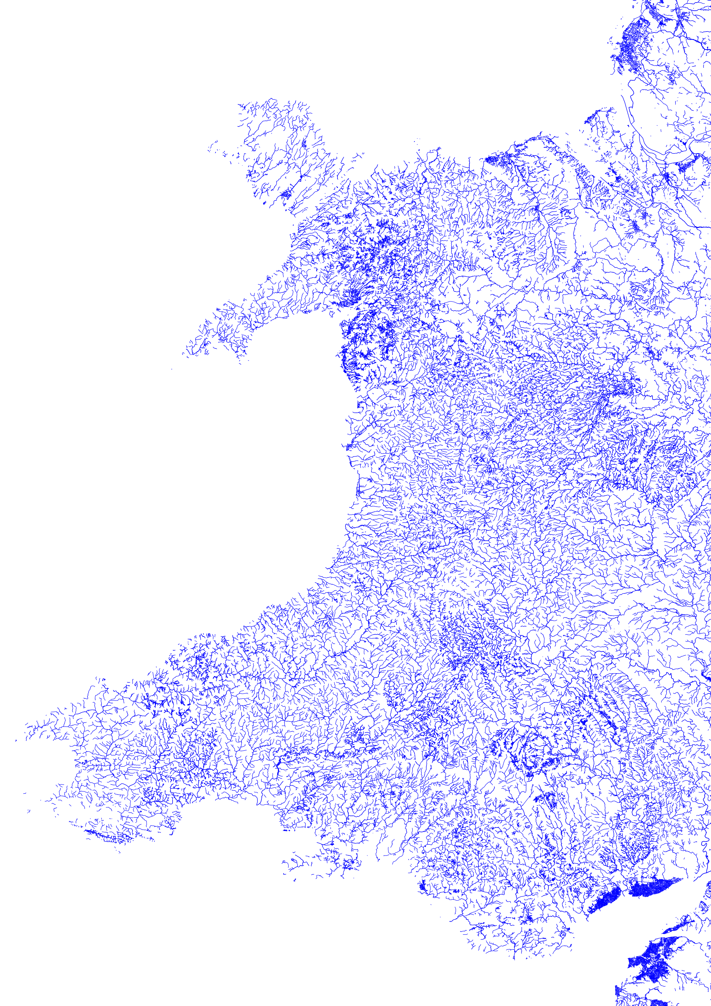
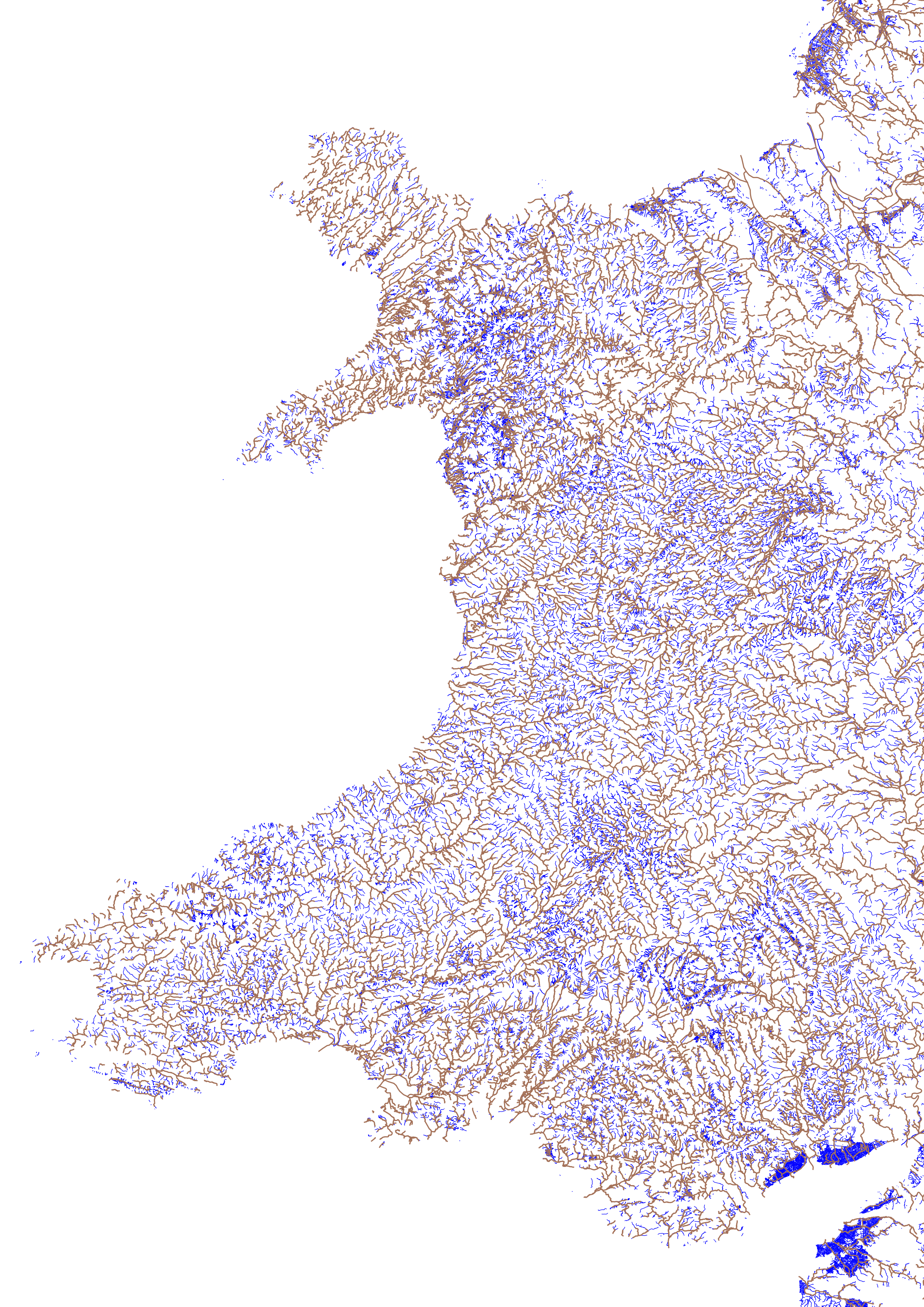
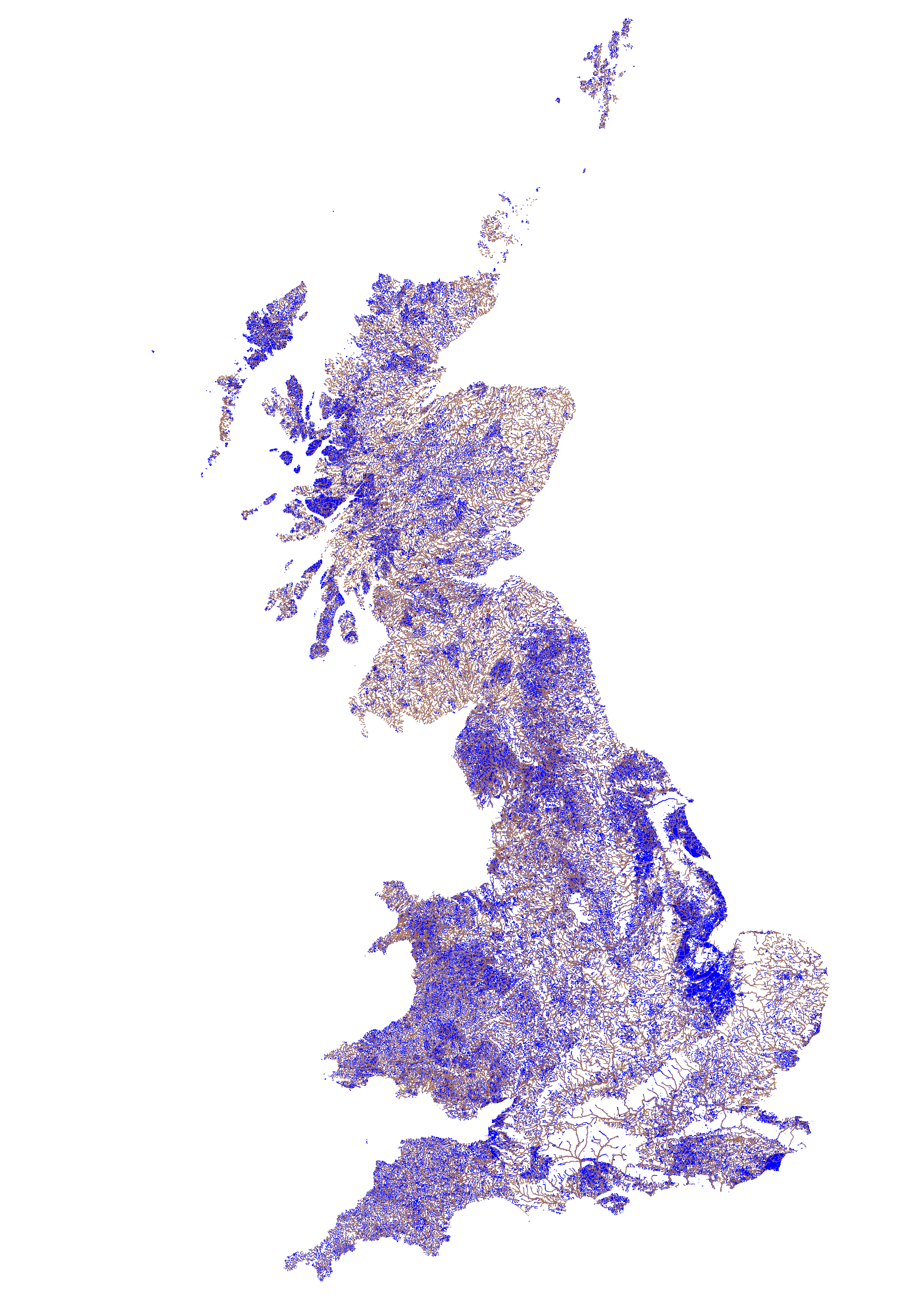
For the twentieth #30MapsInAMonth are a set of map using OpenStreetMap and Ordnance Survey to look at rivers and streams in the Islands of Northern Europe.
These three maps show difference scales and how different tags affect the maps.
#water #rivers #WorldMap #OpenData #30dayMapChallenge
The final two maps then overlay the OSM and OS data to see how they compare.
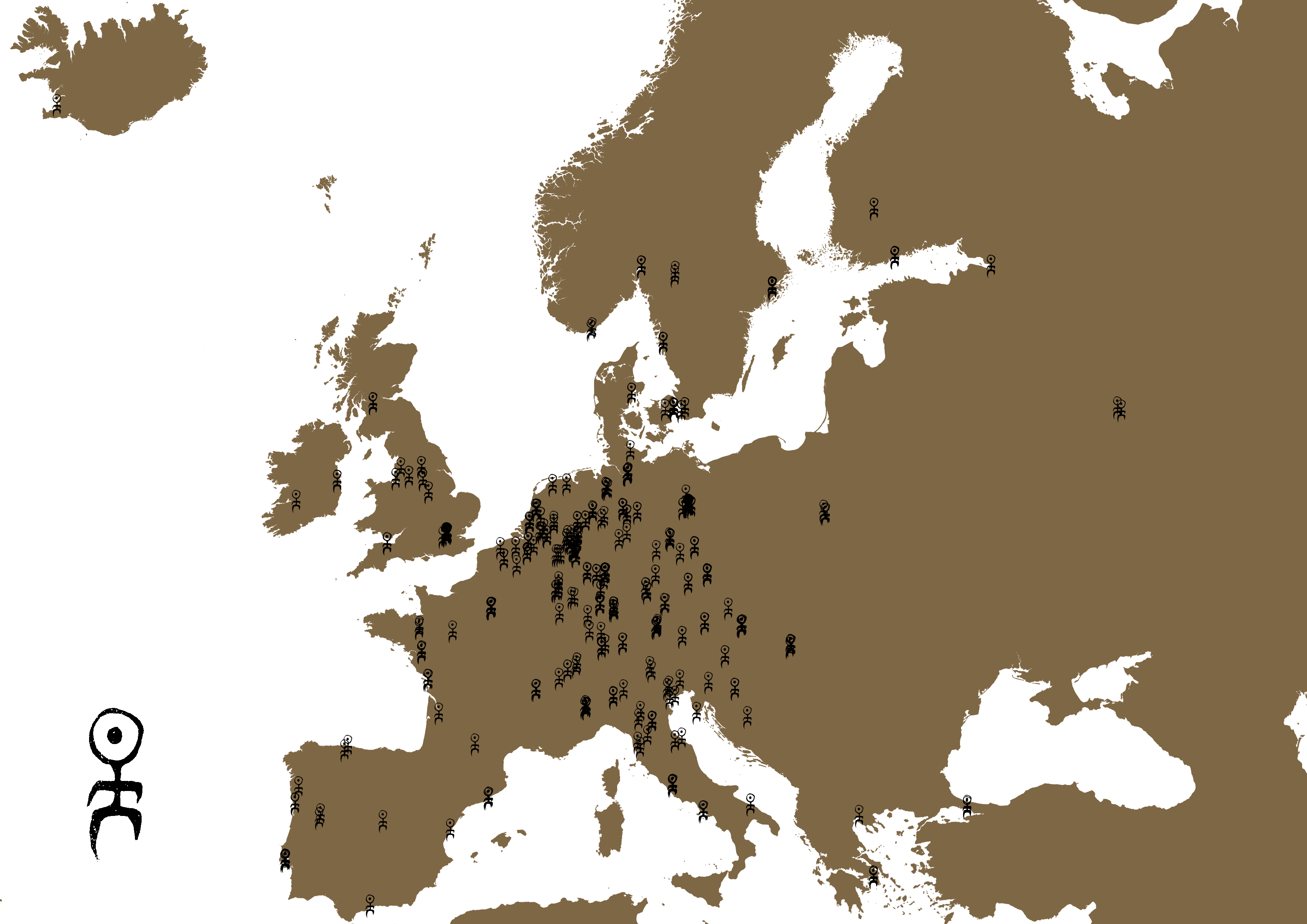
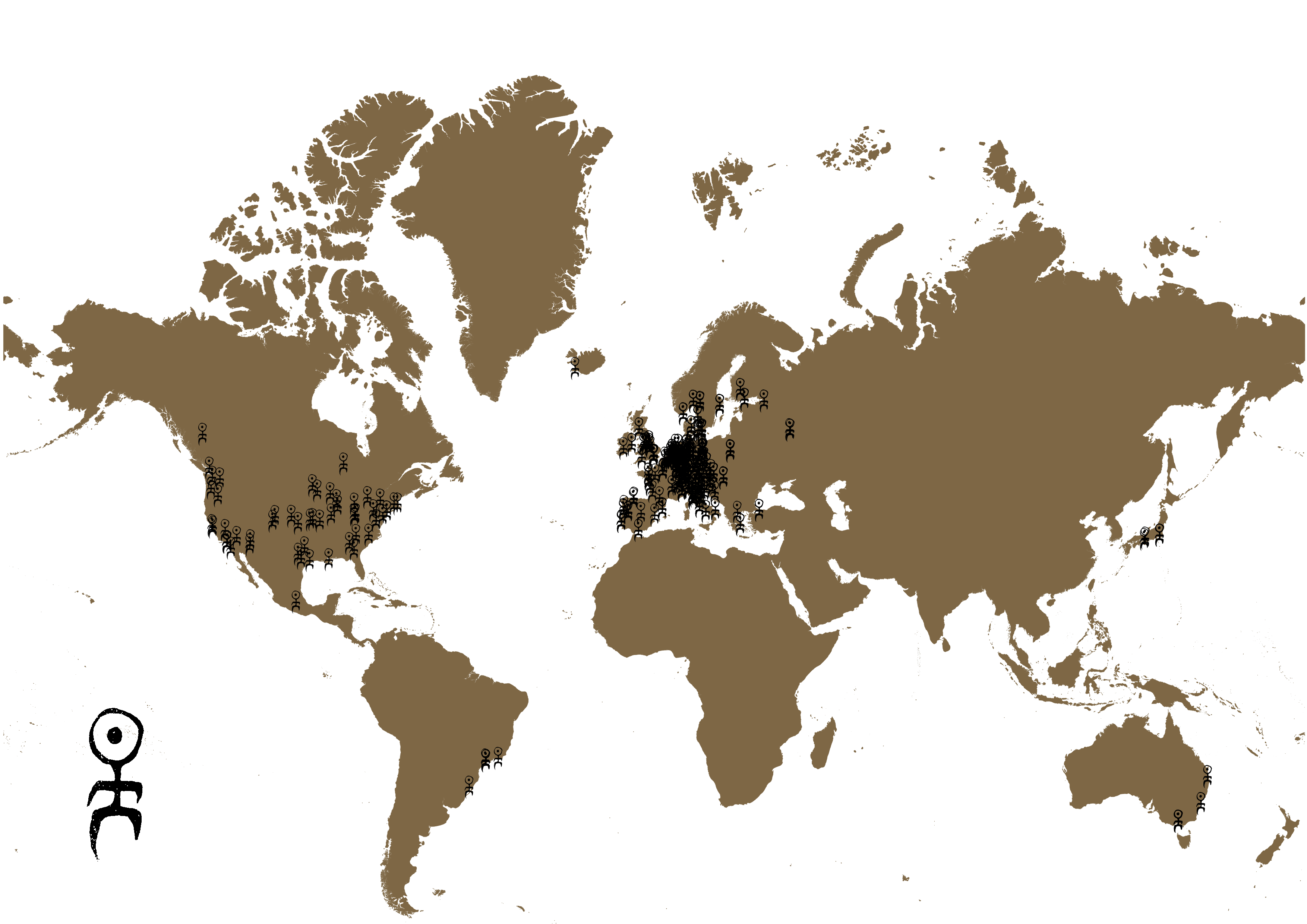
For the twenty first #30MapsInAMonth are two maps showing concerts played by the experimental music group Einstürzende Neubauten using the band icon.
The two maps show all concerts in European and the world and is based on geolocation using data from https://www.fromthearchives.com/en/chronology1.html.
“You will find me if you want me in the garden, unless it’s pouring down with rain.”
#EinstürzendeNeubauten #TheGarden #Europe #WorldMap #OpenData #30dayMapChallenge
Week 4
Intro to the Outro
It was at this point that I could then see the end and had something prepared for everything outwith “Black” and “Makeover”. Which was a relief, especially when I got a steer on “Black” based on air-pollution data from the UK National Atmospheric Emissions Inventory.
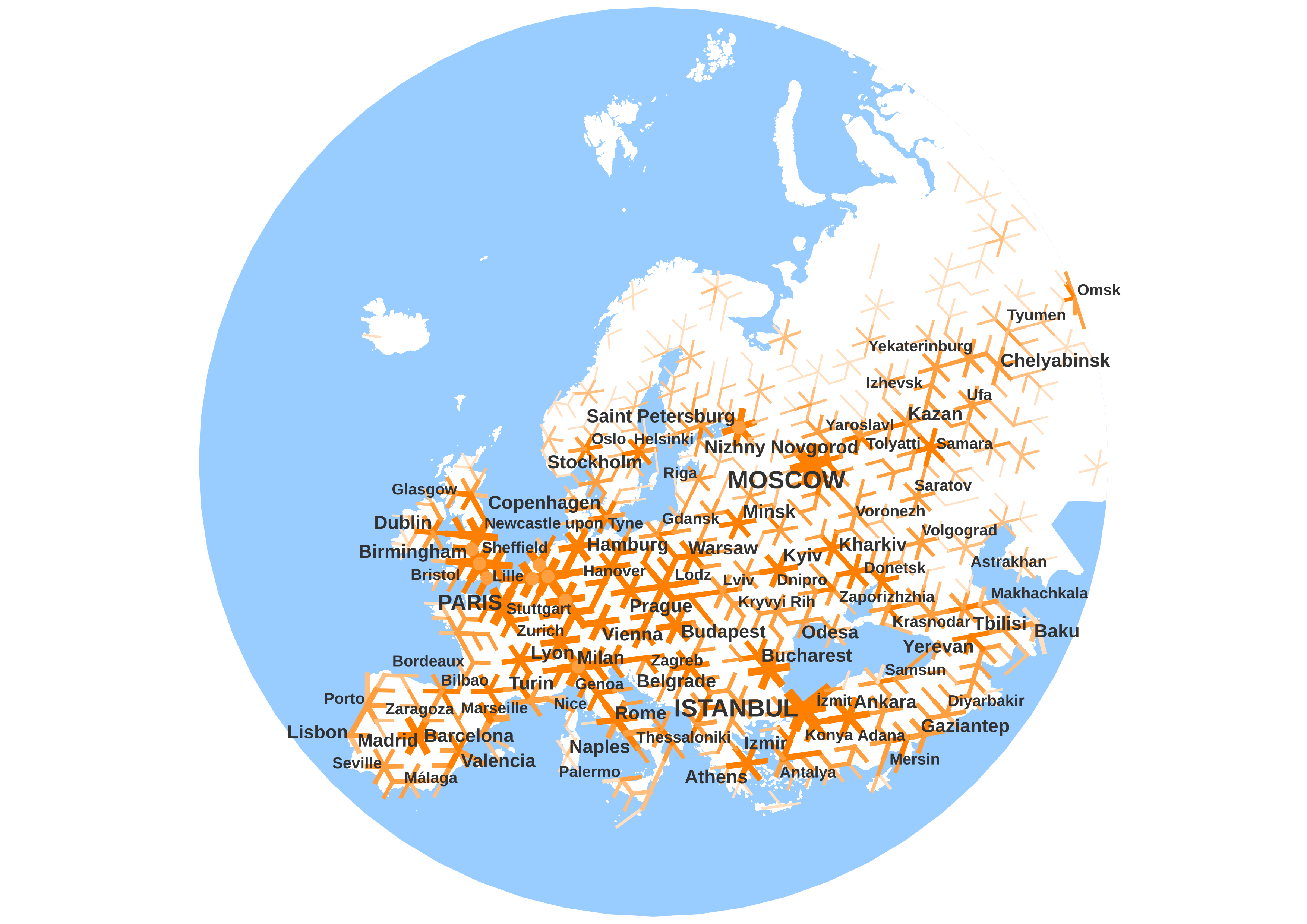
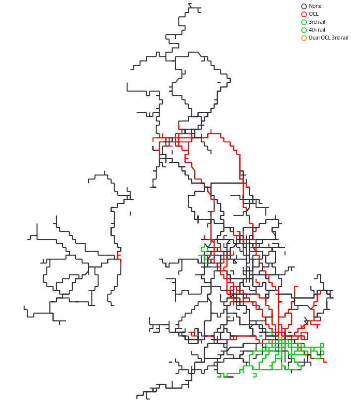
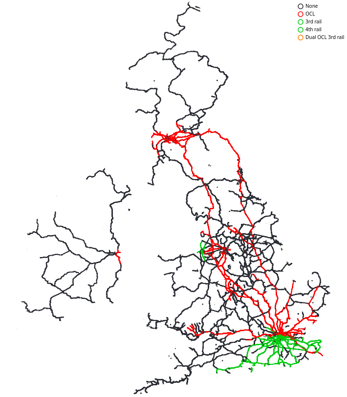
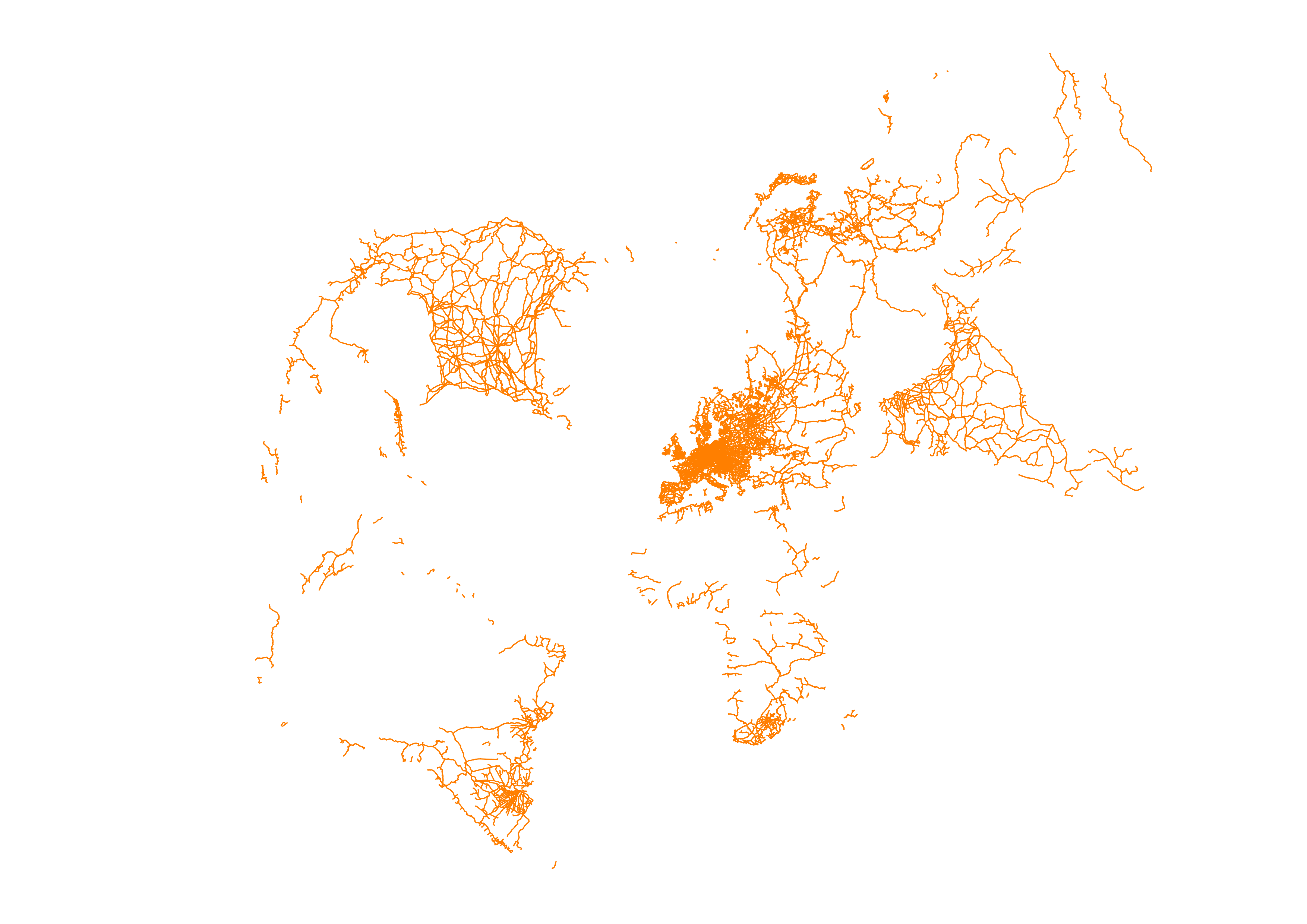
My thought for the “Makeover” was to then redo the Fully Automated Luxury European High-Speed Railway from 2025-11-03 but went with a recut with a global electrification map, of the . Which was more popular then the theoretical high-speed rail map, and vox populari vox dei and all that.
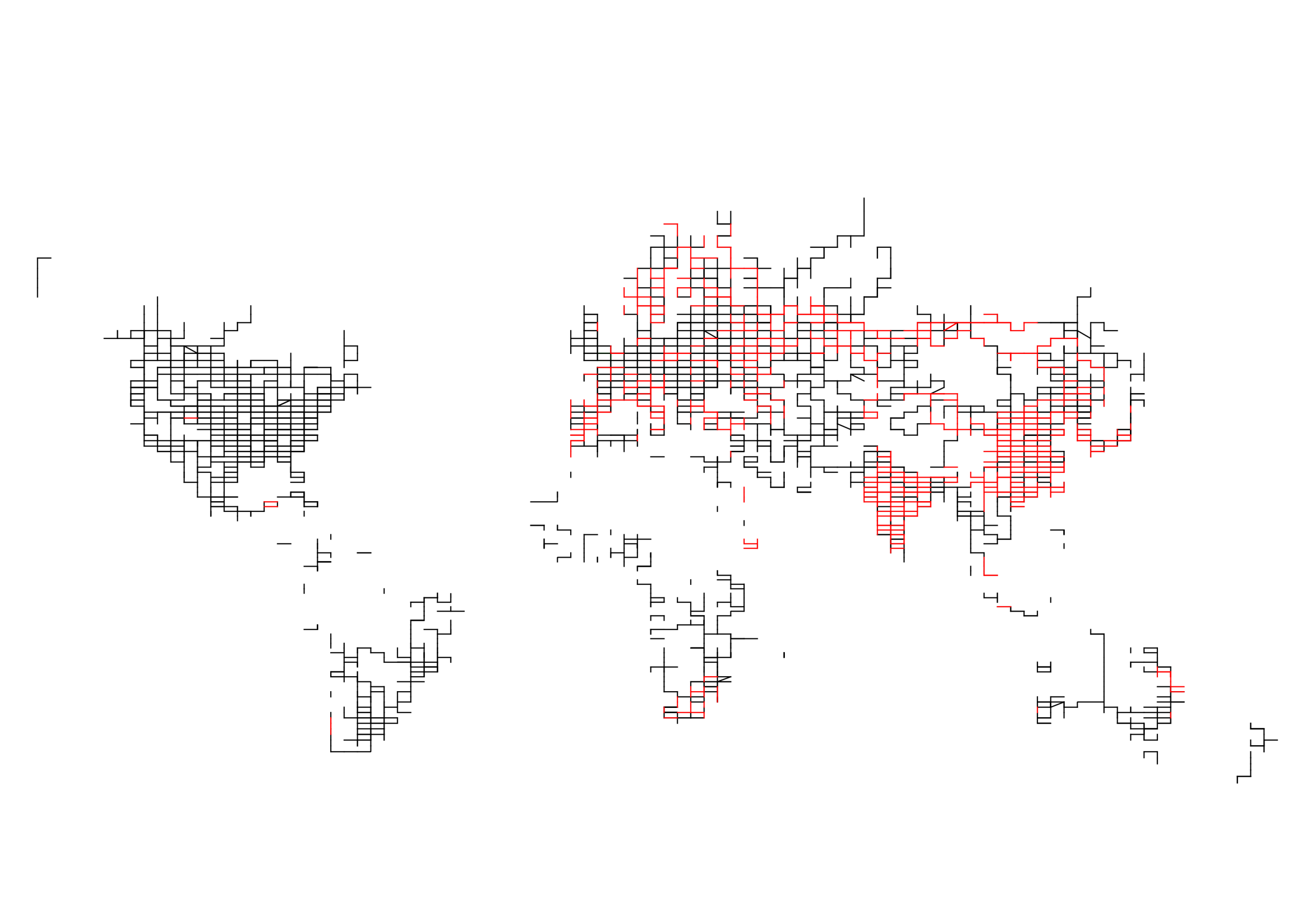
For the twenty second #30MapsInAMonth are three maps showing Natural earth data.
The first map show the 10m urban layer for the low countries, the second two the Islands and Northern Island and Europe with heavy rail lines.
#NaturalEarthData #Europe #Population #OpenData #30dayMapChallenge
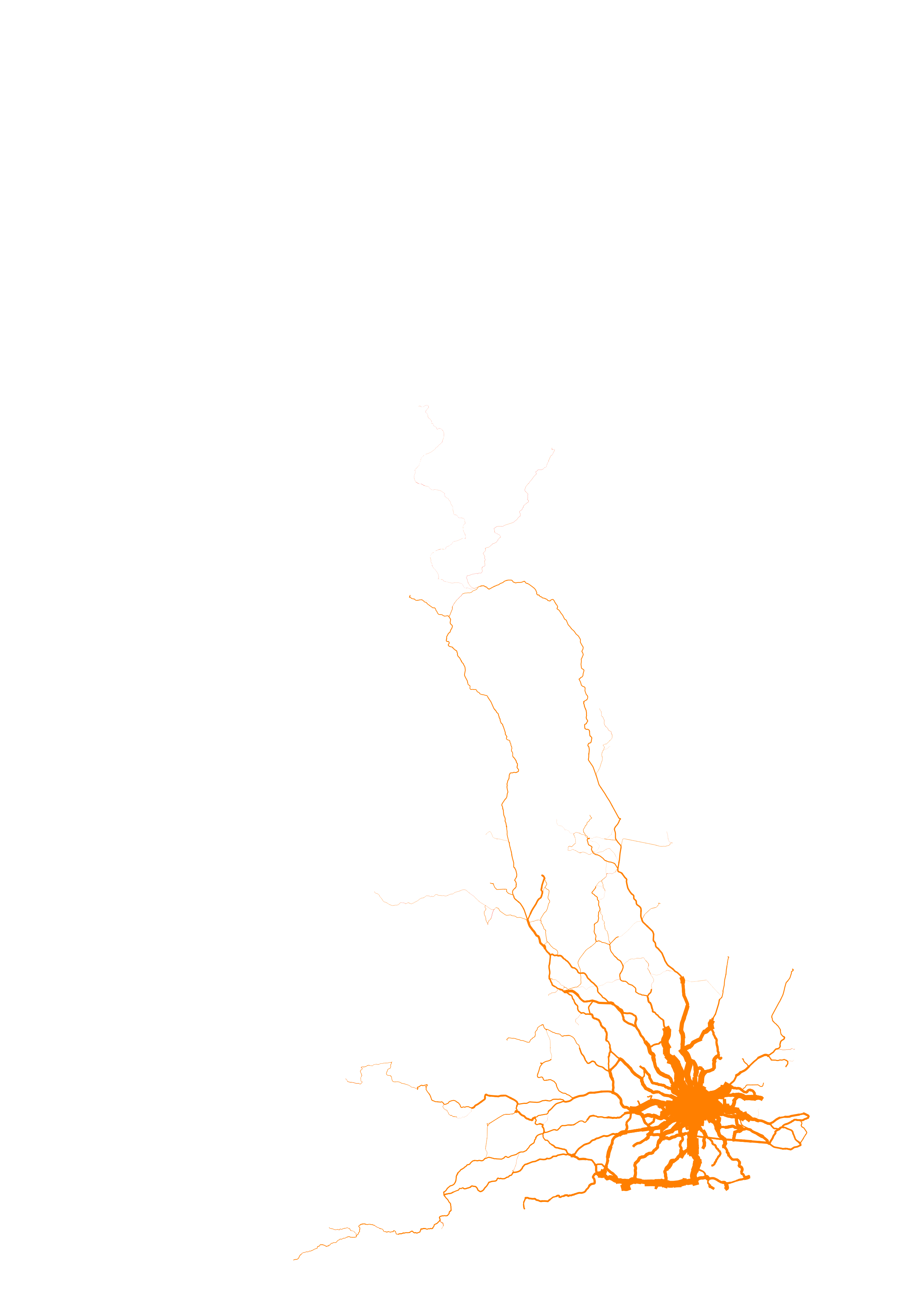
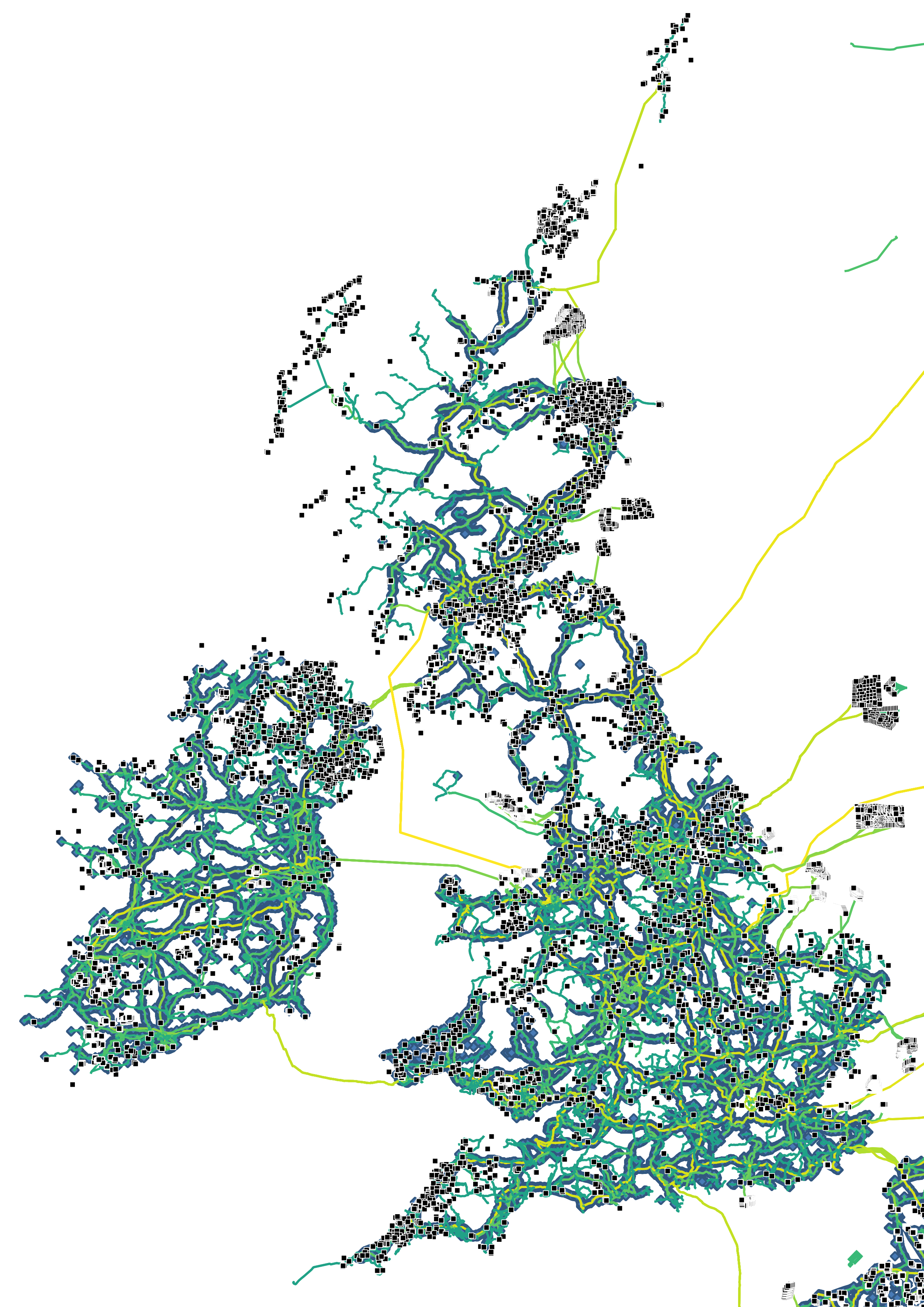
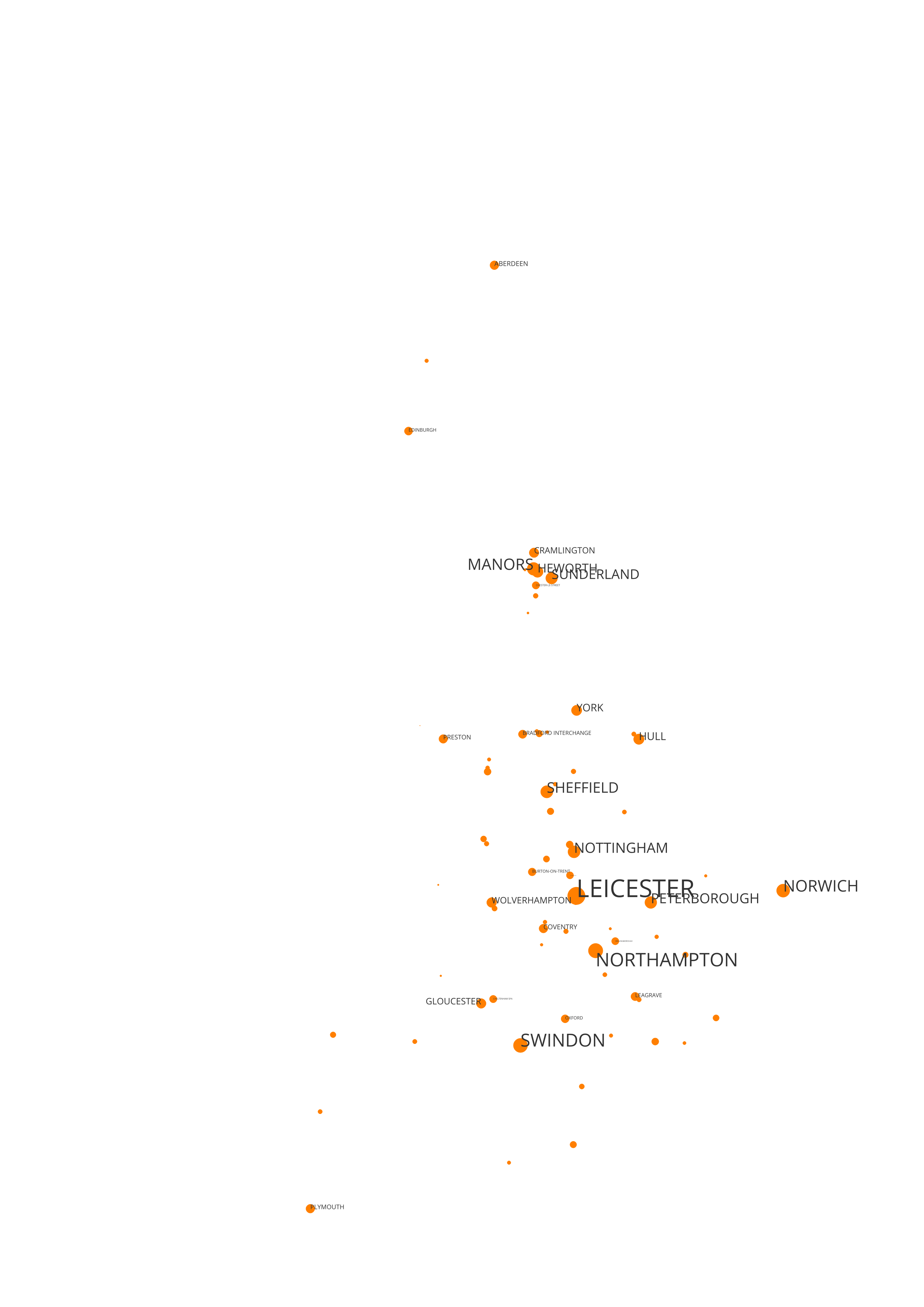
For the twenty fourth #30MapsInAMonth here is a map that shows the stations where the aggregated number of people living within the shortest walking distance to a heavy rail station is greater that 50k. The station name is scaled based on this aggregated number.
#Passenger #Rail #ShortestTravel #Station #30dayMapChallenge
I find it interesting that, although there is a higher population in the South East and North West, this would suggest relatively fewer stations serving the population along the route of the Midlands Main Line (MML) or in the North East around the Tyne and Tees.
This visualisation caused the most debate its means, where I found it useful to refer to the post where
(It’s based on a dataset where I worked out the shortest walking distances from the OA census and/or WorldPop 1km2 centroids data to heavy rail stations to end up with a watershed diagram as shared earlier If you then add up the population served by station and rank them, you get this…)
For the twenty fifth #30MapsInAMonth are a series of six maps showing WorldPop 1km2 population data aggregated into a hierarchical set of scaled hexagons.
Here are some more at increasing levels of granularity.
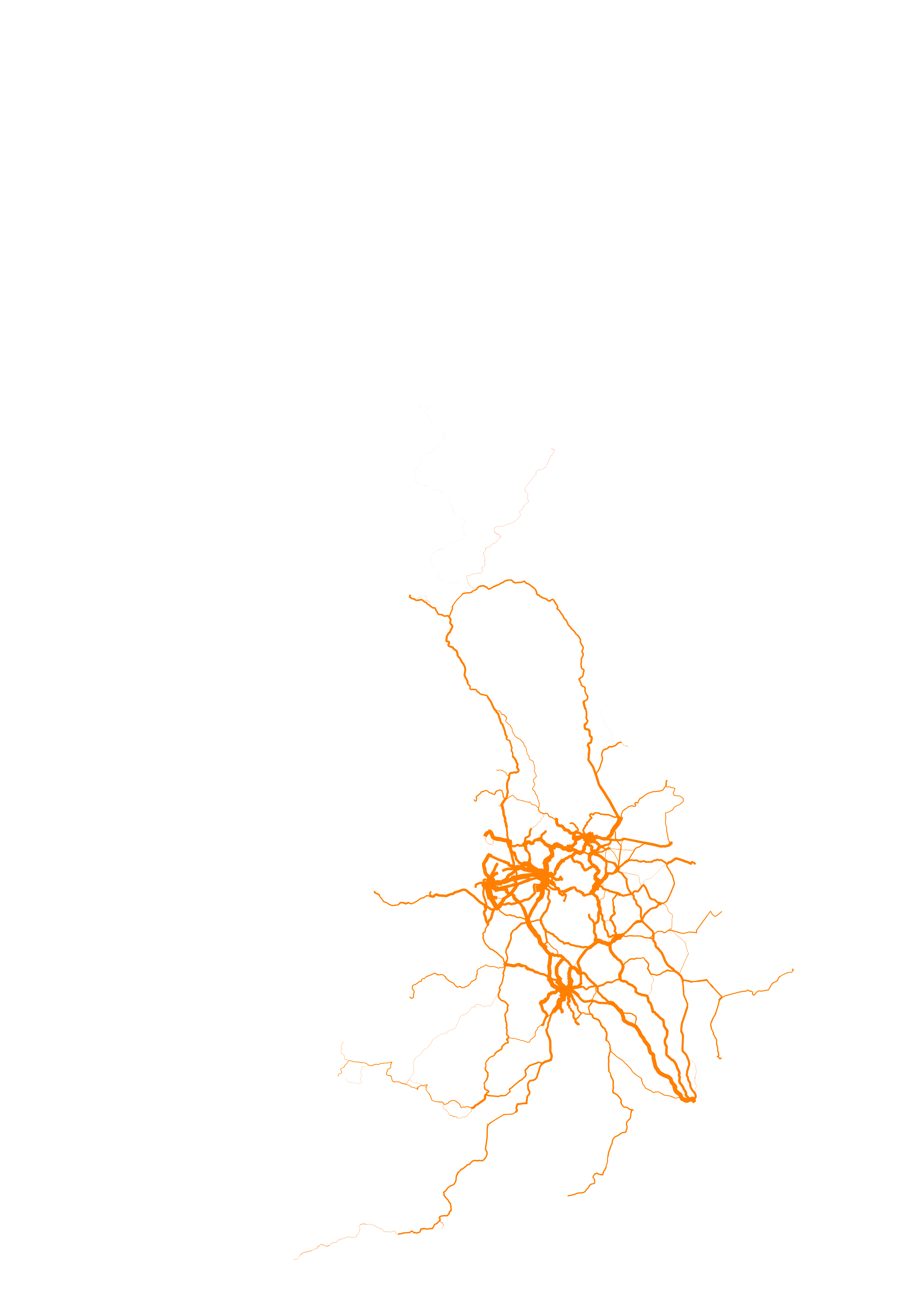
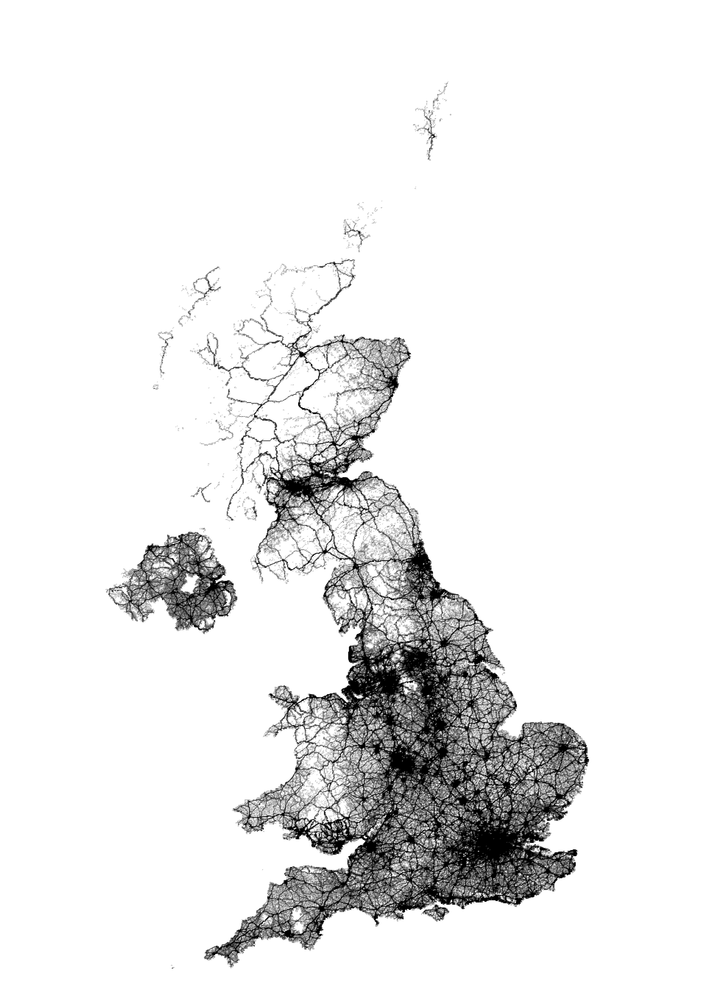
For the twenty sixth #30MapsInAMonth is a visualisation using the Office of Rail and Road (ORR) Financial Year 2018/19 to 2023/24 passenger travel data projected onto a Network Rail shortest-path network using the centre-line track-model to create visualisation for passenger journey numbers for the active rail stations across the British rail network.
#Passenger #Rail #ReproducibleCode #30dayMapChallenge
For the twenty seventh #30MapsInAMonth is an animation showing the organisational operational boundaries boundaries of Network Rail using FOI data in a jazzy shaded colour scheme. This shows region, route, maintenance delivery unity and TME*.
* if truth be told, I don’t know what a TME is…
For the twenty ninth #30MapsInAMonth are two visualisations based on the WorldPop 2030 projected population as 100m² raster data. The first shows the population of the Islands of Northern Europe and the second population change.
#Raster #Population #Beethoven #GBR #IRE #OpenData
To provide a European perspective, if you would like a nine minute video of all the WorldPop raster data for all the countries in Europe, for a given value of “Europe”, ordered by three letter ISO code to the second movement (“Molto Vivace”) of Beethoven’s ninth symphony, here you go
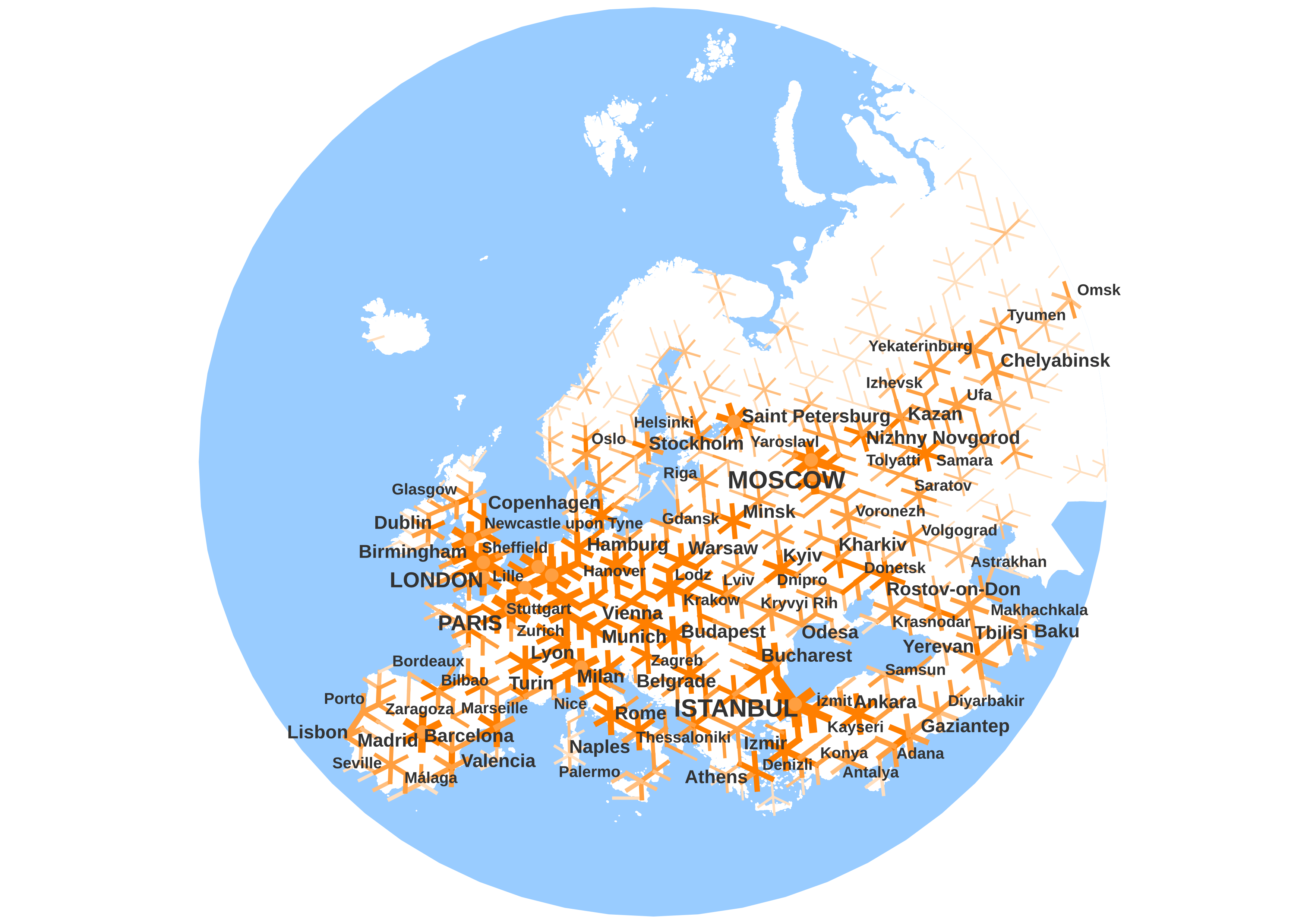
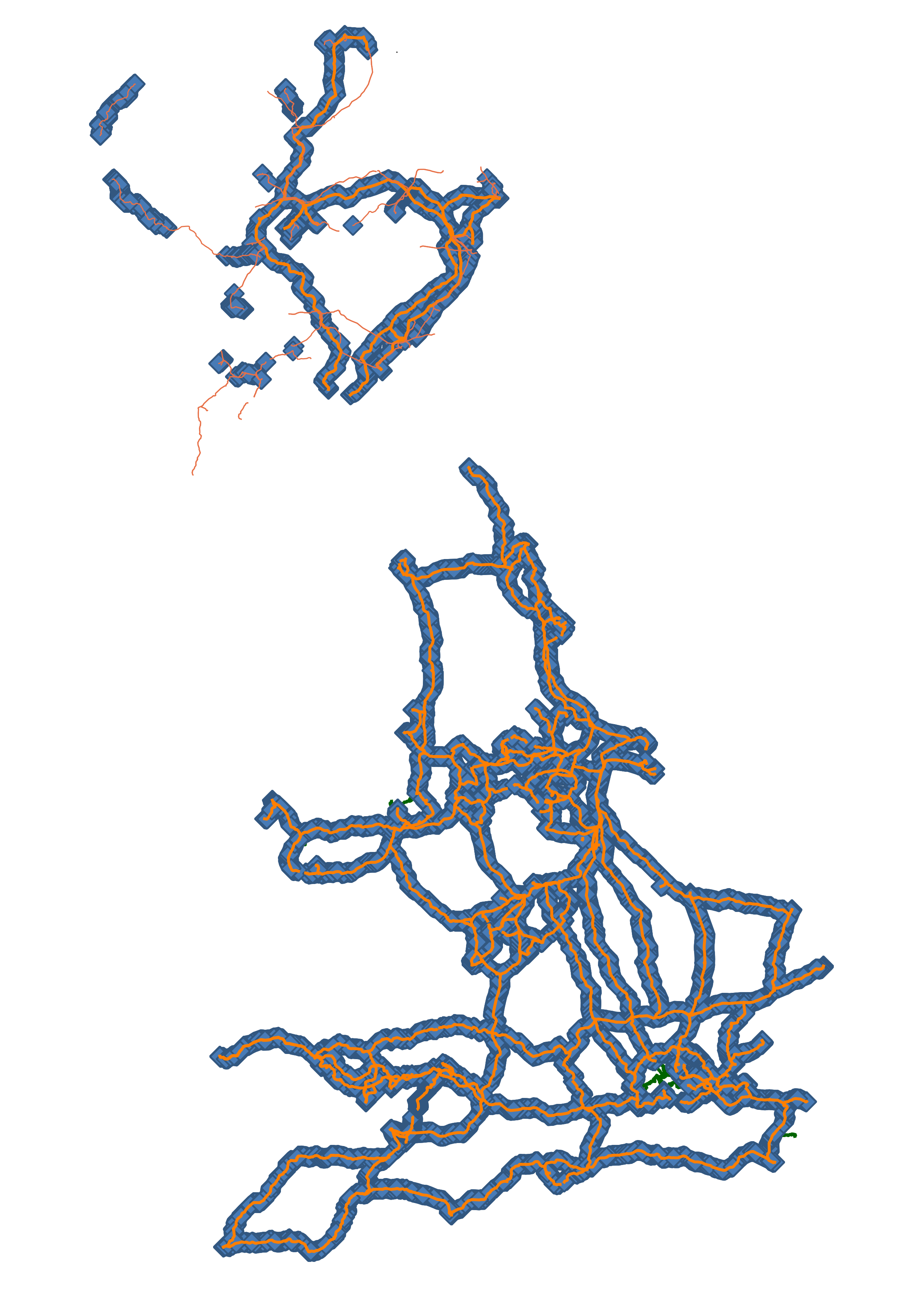
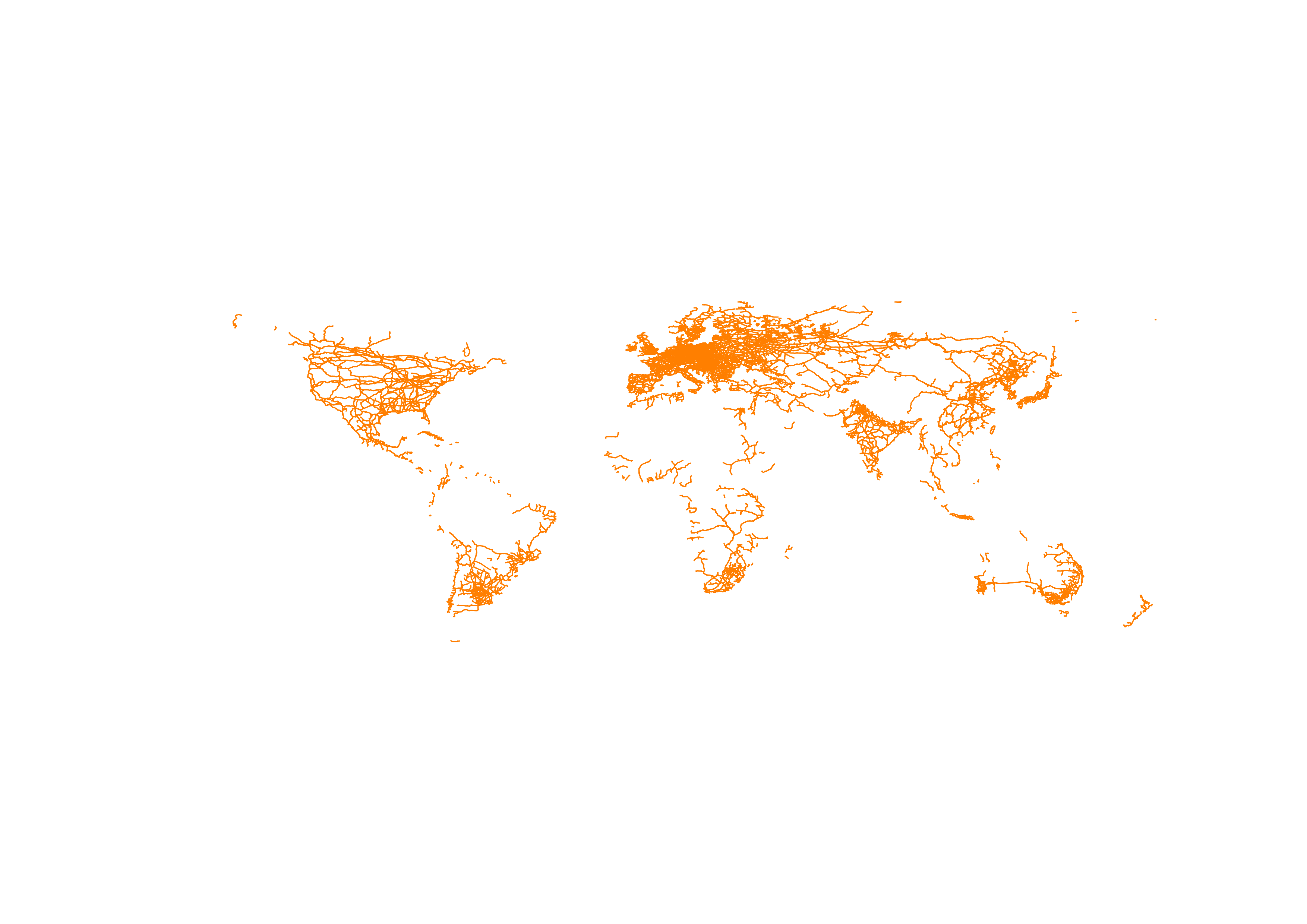
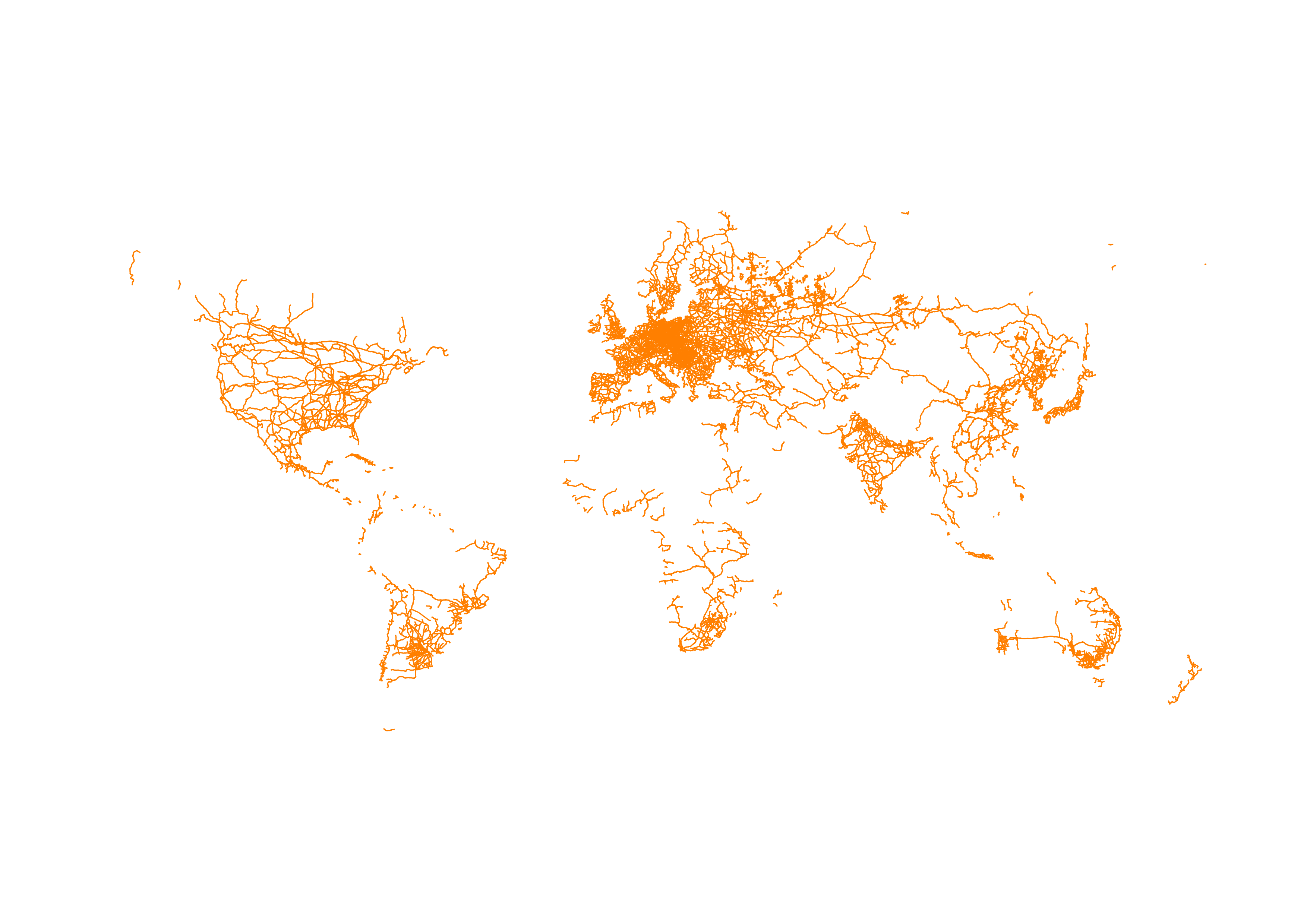
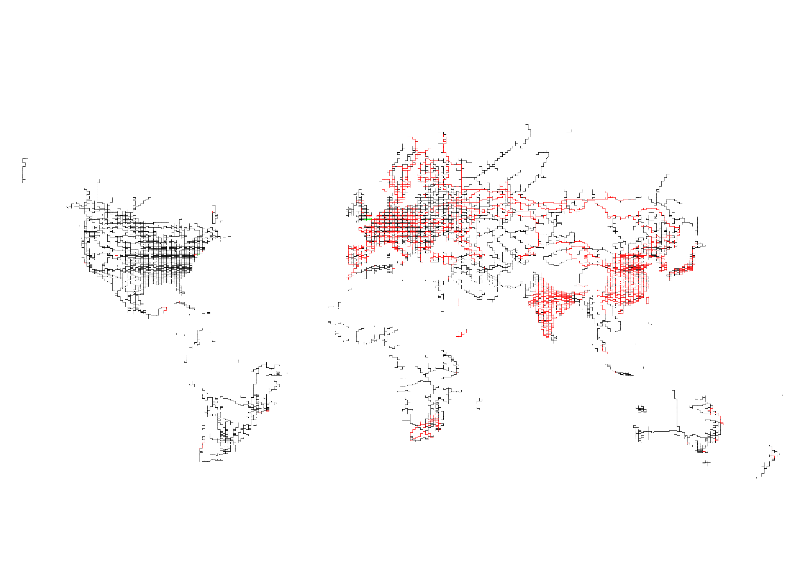
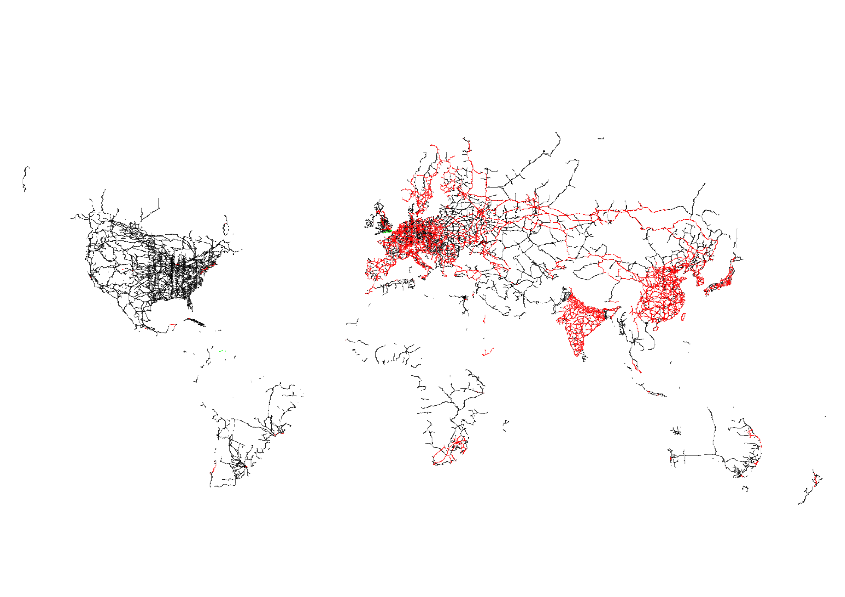
For the thirtieth* #30MapsInAMonth are maps showing the electrification of the global heavy-rail network based on the track-model and electrification and electrification tags from OpenStreetMap
An electric railway is the least carbon-intensive way of moving freight and passengers over long distances**. More so where the electricity generation is from renewable sources.
* and final
** words chosen more carefully
#Decarbonization #Electrification #OpenData #30dayMapChallenge #PublicTransport
While my plan was to make a global full-automated luxury high-speed railway for the final day, I chose to makeover the electrification maps because they seemed to be of most interest to people.
Outwith the ORR ODM data map and they will get updated once next FY year’s data is published…
This has been hard work and probably took up more time than it should have. Equall I did bigger things than I had thought I could. But quite a lot of what I first thought I would post I haven’t. Often because it didn’t fit the theme.
I also found myself at a point about a half-way-through where I decided to get stuff made ahead of time. Which was good as it meant I finished the whole piece and had things to say each day that vaguely fitted the theme. However, this didn’t help with the actual daily posting itself.
This is hard, as a combination of social-media file-size and resolution limits, my inability to articulate what it is that I have just done in words, a wish to post insanely large images and the general yak-shaving of getting animations to work was probably trickiest bit for me. No fun.
But this is where I am now
After a brief period of activity, where I have posted a lot of maps for a month, I now plan to return to my usual approach of mostly ignoring posting anything unless I really have to.
Making things that are nice to look at, learning new stuff, and the general interaction and feedback kind makes it worth it though.
TL;DR some people liked it and I learnt some stuff. Maybe that’s enough.